Happy New Year to all you lovely people. I hope you and yours had a wonderful festive period and that 2016 will be filled with loads of good stuff for us all. I am personally not-so-secretly delighted…
In a little over three months I will be welcoming baby number 3 into the world. It’s a boy this time. I am filled with a mixture of excitement and apprehension at the unknown quantity that is a small boy-child. I have two gorgeous daughters so all things girl-related I am highly versed in, but a boy…? It’s going to be a whole new adventure and one I am sure I will find incredible if at times nerve wracking.
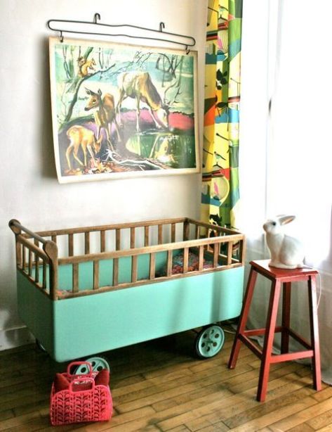
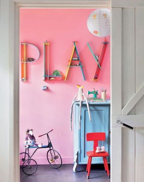
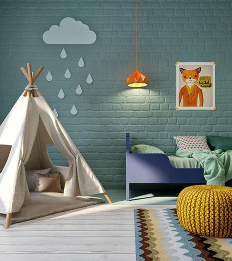
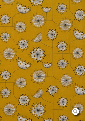
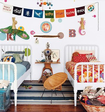
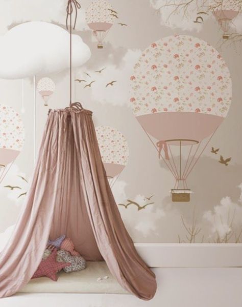
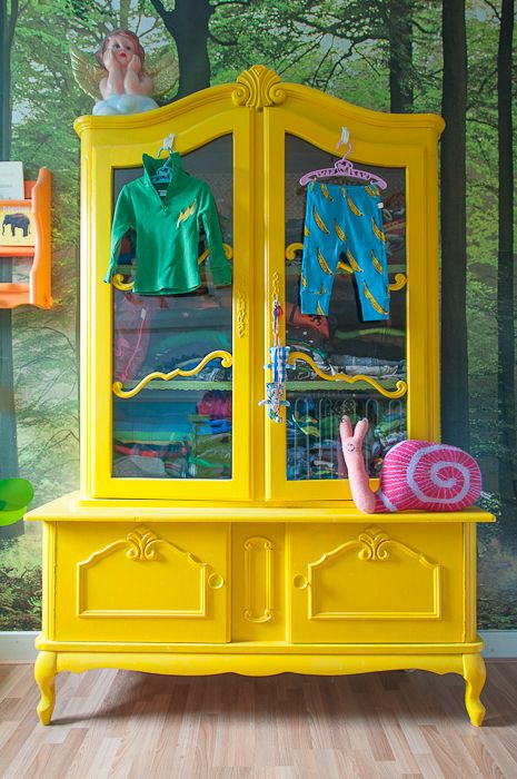
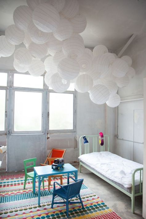
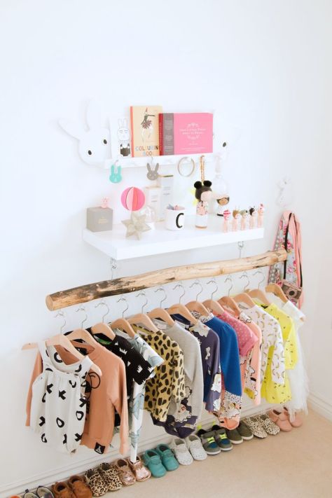
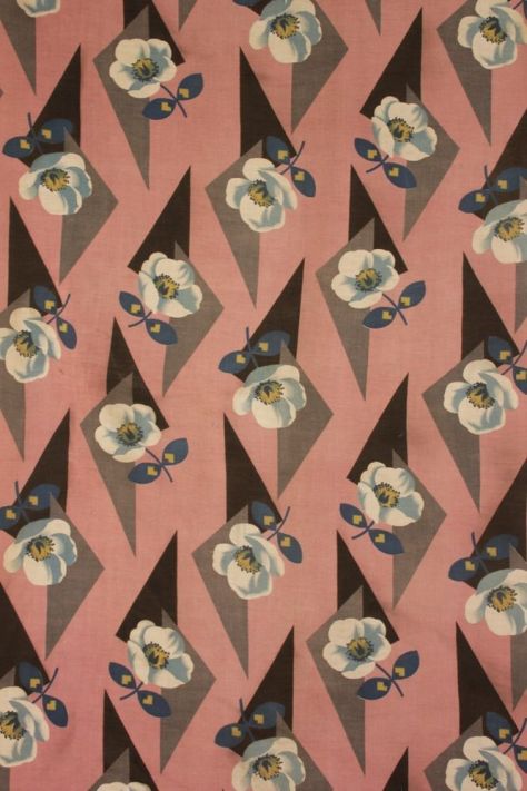
So with the joys of a mostly wet and grey January ahead of me, I have started to turn my head to something not remotely drab and dreary… the design of the nursery. My wish-list is currently: bold, kitsch, quirky, bright, snug, surprising and as eclectic as possible to incorporate things we already have in our home. I am drawn to the colour yellow at the moment, but a 1950s yellow a la extraordinarily talented Lucienne Day or modern-day MissPrint, whose Dandelion Mobile fabric I just adore.
I am sure the design and scheme will morph organically over the coming months, but for the moment, here are some visuals that are inspiring me. Hope you enjoy.
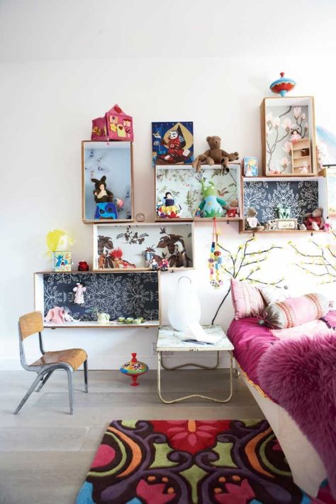
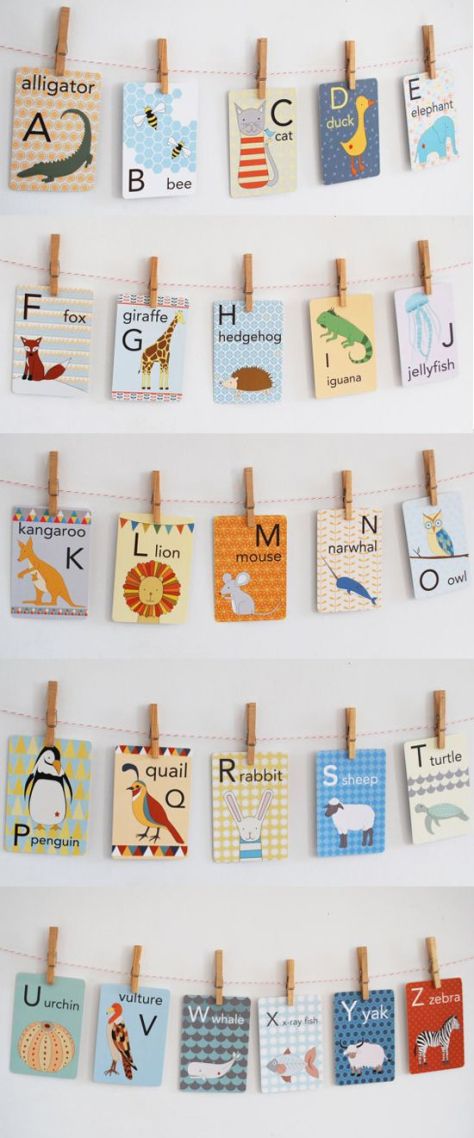
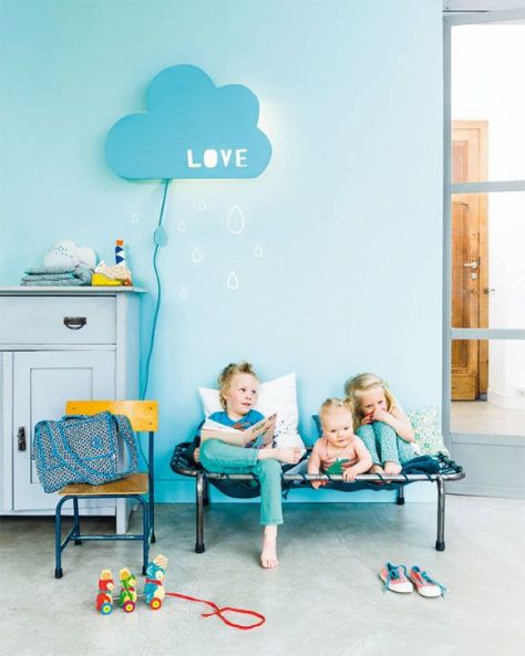
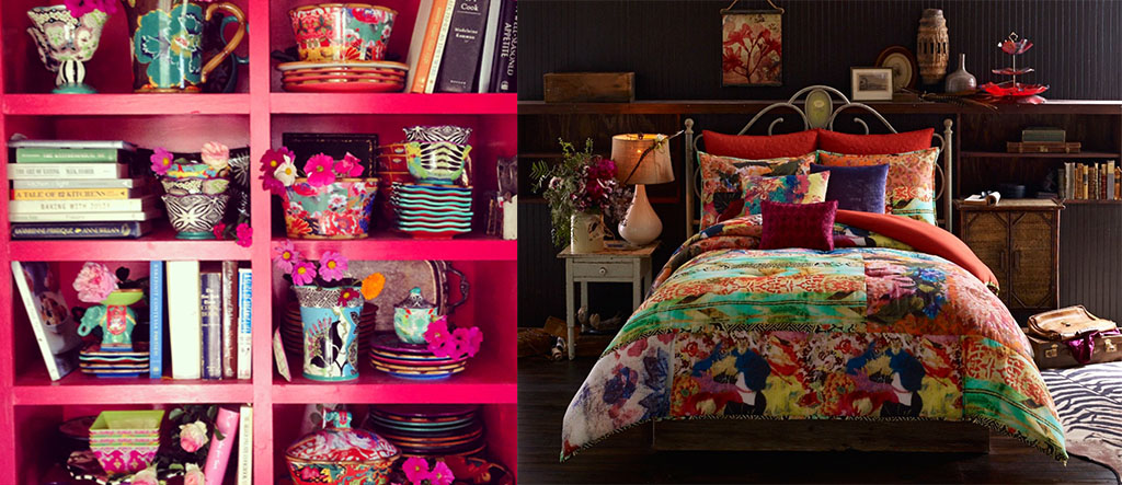
Loving the colours used here and the kitsch prints are inspired. (retourdechine.canalblog.com)Perhaps not pink for a boy’s room, but the different scale of items works really well and I love the shelves/letters. (petitspetitstresors.tumblr.com)This mustard yellow pouf is spot on and I love the suspended lamp too. (petitandsmall.com)This vibrant print is stunning… (shelleysdavies.com)MissPrint Dandelion Mobile print.Great shelving ideas. (handmadecharlotte.com)Animal alphabet cards for the nursery – educational and also look adorable on the wall! (etsy.com)Loving this DIY cloud light from handmadecharlotte.com.A room full of colour and character. (flickr.com)Bold wallpaper really works for me. (petitandsmall.com)How to make a statement! (diyordie.elleinterior.se)Habitat 1964 (handmadecharlotte.com)Cute hanging solution. A beautifully organised and bright nursery. (chalkkids.co.uk)A simple and effective way to create a quiet snug area. Love the colour of the side unit too! (dig-mig.blogspot.nl)Great colour combo. Am particularly loving the roof pattern. (mommodesign.com)
Apologies for the radio silence. I’ve been super busy the last few weeks getting things ready and setting up a new space in a retail outlet. All very exciting.
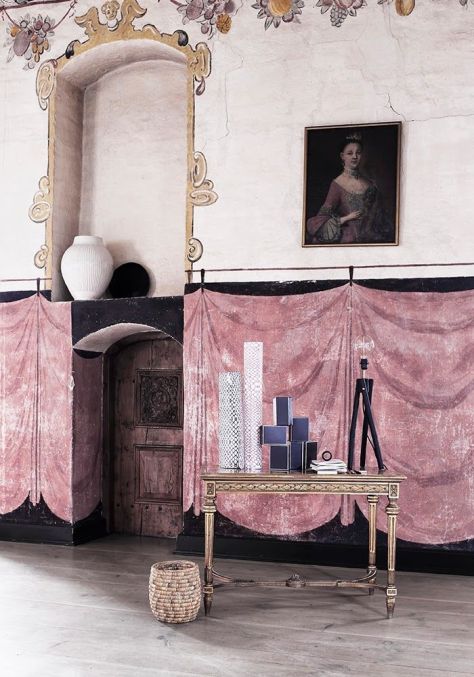
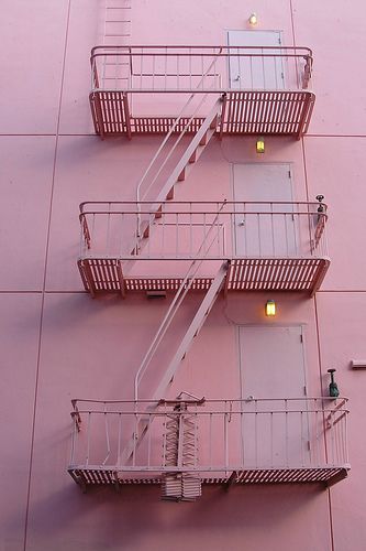
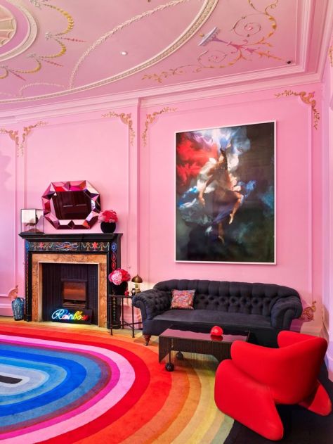
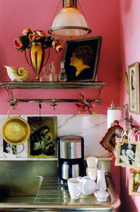
The 1986 film Pretty In Pink became a formative part of my teenage years. Yet, the colour pink in the home has never really done it for me. Well, not until recently that is. I confess to being a complete convert!
Pink in the home can be used in so many different ways. You can introduce subtle pastel pink hues or go full-on saturated in-your-face-pink, or somewhere in the middle. Whole walls can be painted or just well-chosen accent pieces… There is huge scope for experimentation. Combinations that work well are pink and copper, pink and black, pink and concrete, and if you’ve really got guts, pink and red. You can introduce colour through artwork, paint just a door, throw in a vibrant rug or some cushions. If you feel cautious start with soft furnishings as they are straightforward to change. Pink can be sensual or cosy, dramatic or subtle.
So if you are like me – basically turning my nose up at the thought of pink in the home until recently – feast your eyes on these visuals and hopefully you too will see the potential of pink!
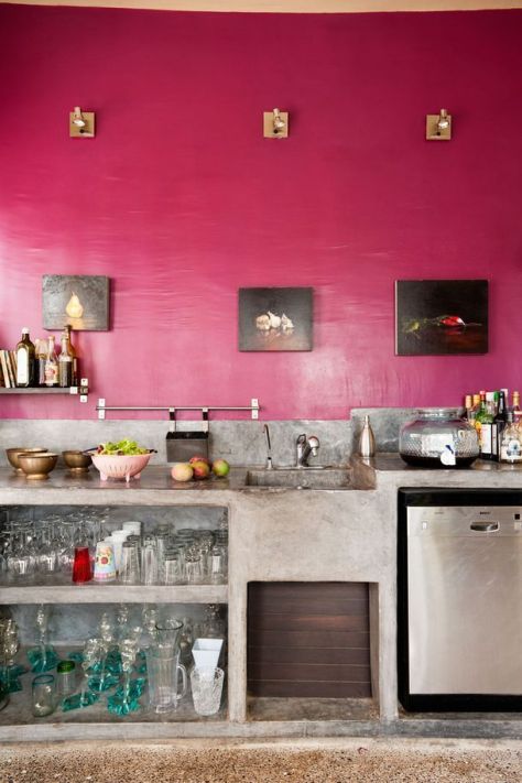
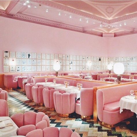
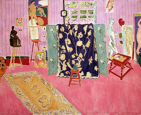
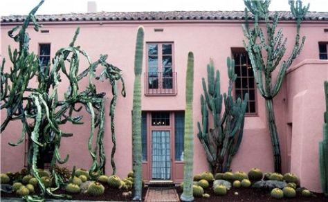
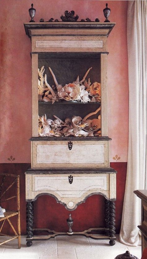
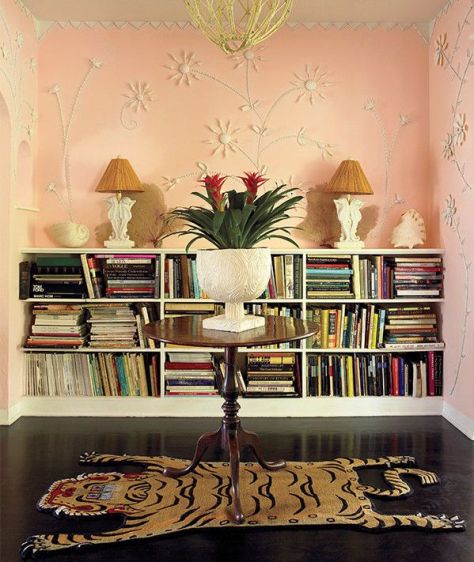
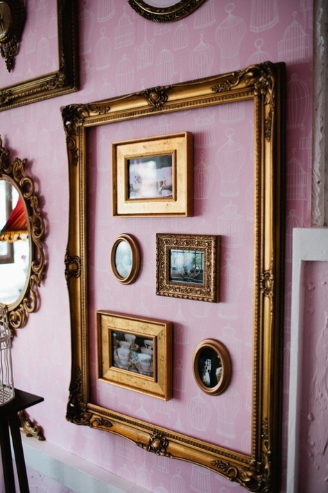
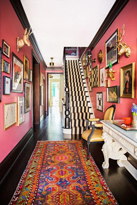
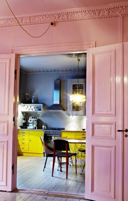
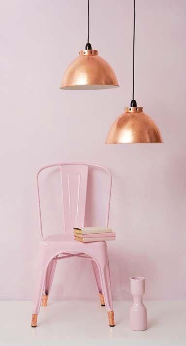
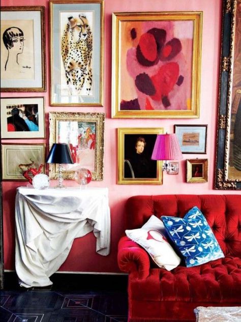
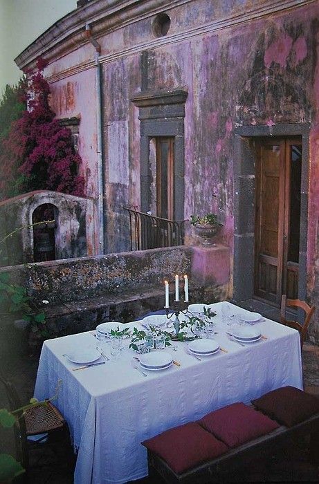
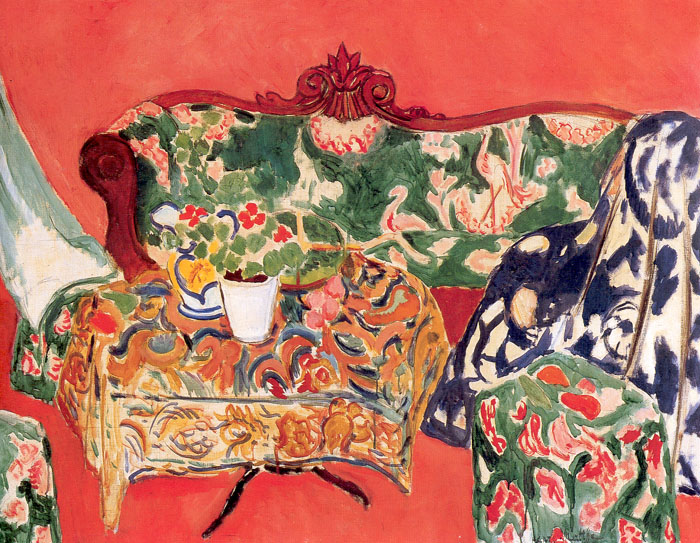
Pink trompe l’oeil. (tinekhome.blogspot.dk)Deep, saturated cerise used successfully in a kitchen couple with concrete. The combination stops the pink being too frou frou! (bloglovin.com)Take inspiration from this truly stunning restaurant interior. The Pink Gallery at Sketch in London // pink dining room with retro chairs and chevron floors. (thecarelessblogger.wordpress.com)The Pink Studio, 1911 by Matisse. (TOPofART.com)If you can pull it off, go big and bold and transform the facade of your home with pink! (reifhaus.tumblr.com)Why not look to existing belongings to determine the colour of your walls. Here seashells have been the point of reference. (chintz-of-darkness.blogspot.com)Pale pink, but done with aplomb. Who doesn’t love an embossed wall. (1stdibs Introspective on Frank de Biasi / 1stdibs.com)Pink wallpaper punctuated with vintage frames. (boho-weddings.com)Creating a bold statement hallway using salmon pink, and black and white. A combination that definitely works. An eclectic collection of artwork, a vibrant rug, and monochrome stair runner all help pull this strong look off. (domino.com)Introduce pink through fabric and soft furnishings. This Art Deco fabric (1920–1930) would look incredible as curtains. Think sophisticated pink… (pinterest)In the pink. (flickr.com)A pink accent chair. (lisasaysgah.com)Not for the faint-hearted! Pink living room in the home of designer Solange Azagury Partridge – Photography by Neil Gavin (wmagazine.tumblr.com)If you’re going to go pink, go pink… I love the combination of pink and yellow kitchen units. (ilovepolkadot.blogspot.no)I just love this image. (theleoisallinthemind.tumblr.com)Pink and copper. And a tolix chair. What’s not to love! (ideasmag.co.za)Be bold and brave… combine pink and red for a truly dramatic look. (pinterest)Or create a mediterranean roof-dining experience and give the exterior of your home a lush pinky colour wash. (pinterest)Pink doesn’t have to overpower. Here it is used effectively with a combination of seemingly clashing patterns to great effect. (pinterest)Another kitchen. The pink works as a powerful backdrop to a very personal collection of belongings. (pinterest)And to finish, a gorgeous pastel pink geometric artwork. (pinterest)
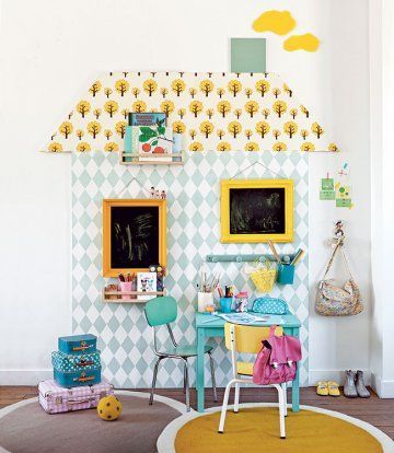
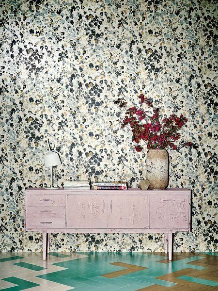
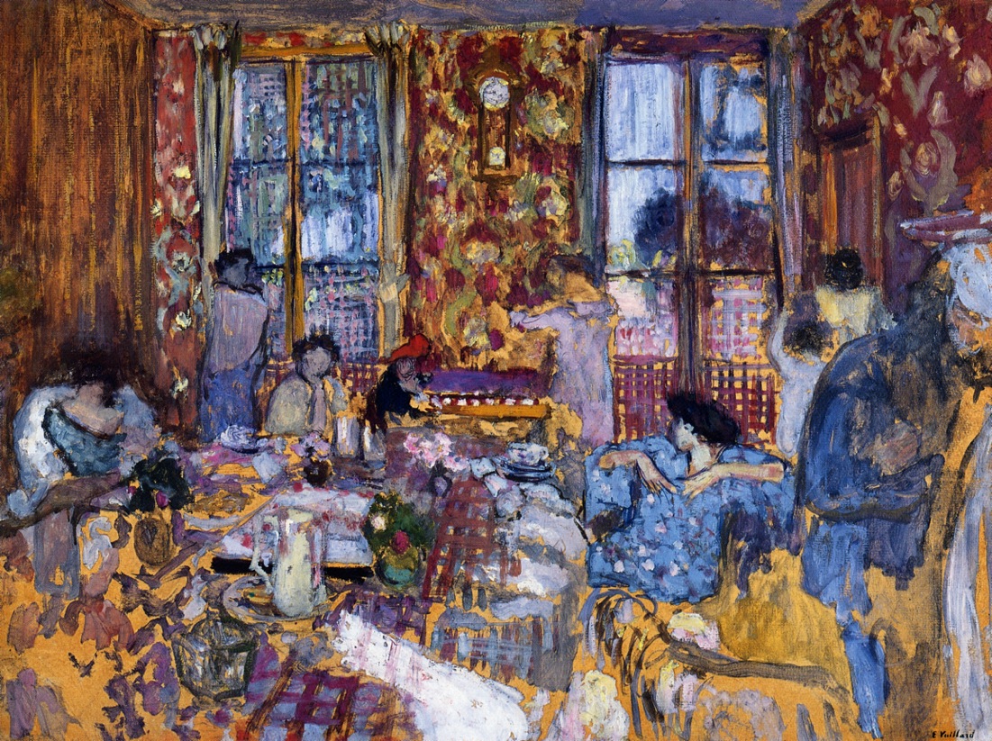
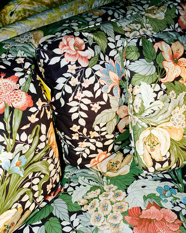
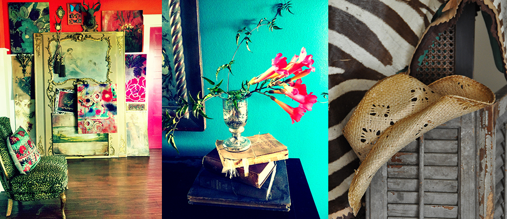
Who doesn’t love pattern? I certainly do. My philosophy is that there can never be too much. Pattern clashing rules.
Perhaps not for the faint hearted, but you really can layer pattern on pattern to your heart’s content. I can’t imagine a world without pattern. And a home without pattern… doesn’t bear thinking about! It can seem overwhelming dealing with pattern, but with a few basics up your sleeves and some belief in your ability to select and combine prints, you’ll be amazed at what can be achieved.
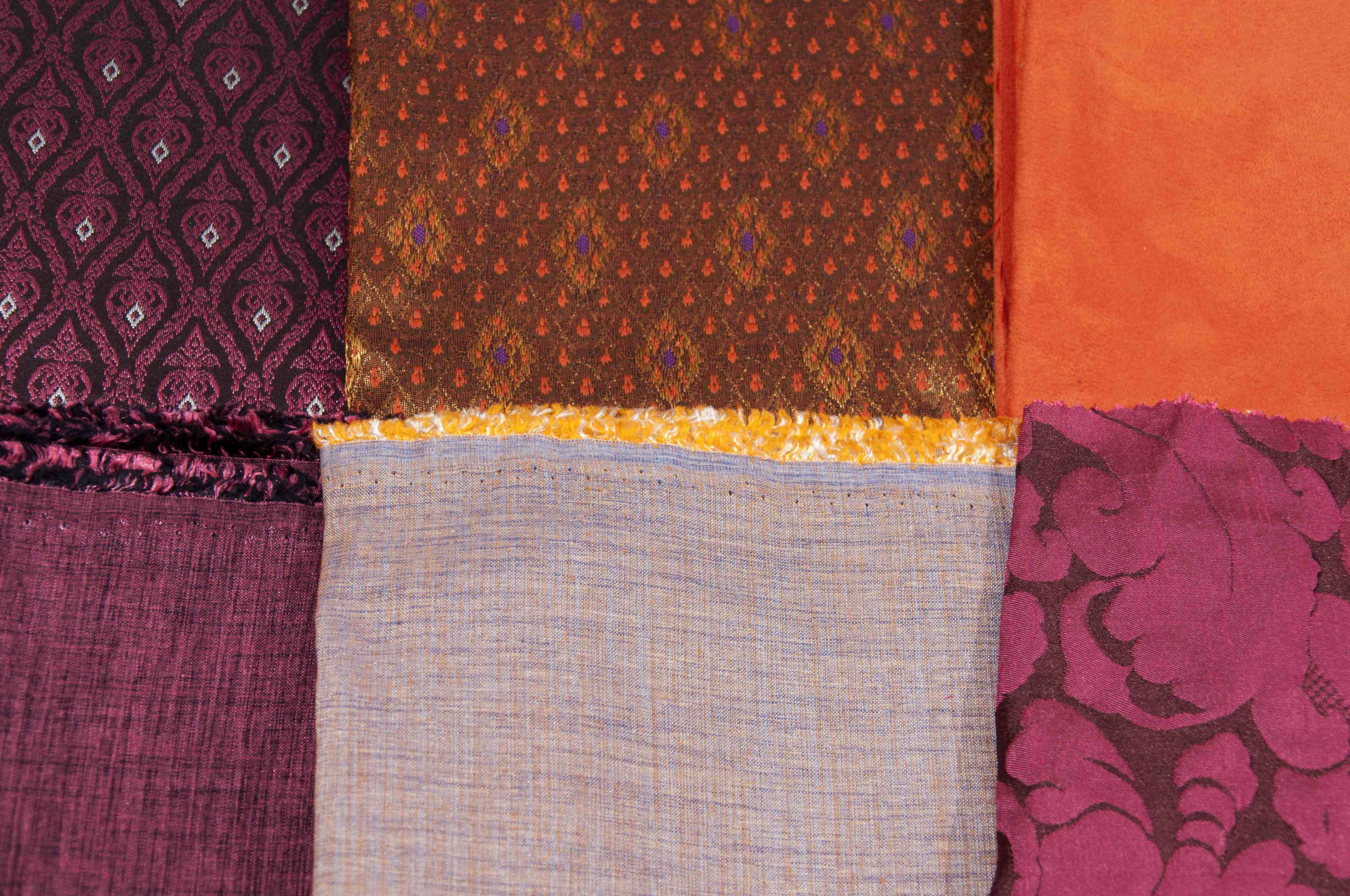
It’s not just about being brave with pattern; be adventurous with texture too. You can introduce pattern and texture into your home in many different ways. An obvious way is through accessories such as cushions, curtains, rugs, and throws. Wallpaper is a fantastic way of adding both pattern and texture. I am a huge fan of wallpaper (so much so I wrote and curated The Wallpaper Colouring Book!). These days you can find stunning wallpapers in all price ranges. Wallpaper Direct is a great starting point. It should come with a warning though… I can spend hours exploring on there and whole days can be lost.
Artwork is another way of bringing pattern into the home. This is a clever way of getting your pattern fix without committing to anything too permanent. I often frame wallpaper samples or pages from magazines to create mini worlds of pattern on the walls of my home. Experiment. If you don’t like it you can always change it at hardly any cost.
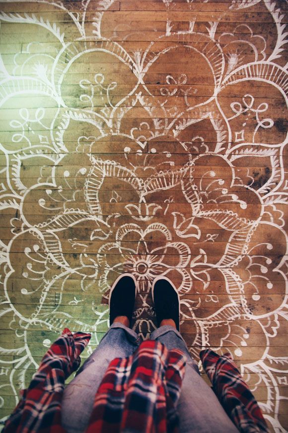
Stencilling is another way of adding pattern. On floors, walls and furniture, stencilling has come a long way of late and there are some truly beautiful sources of inspiration out there. Just stick ‘stencilling’ into the search bar on pinterest and you will be spoilt for choice!
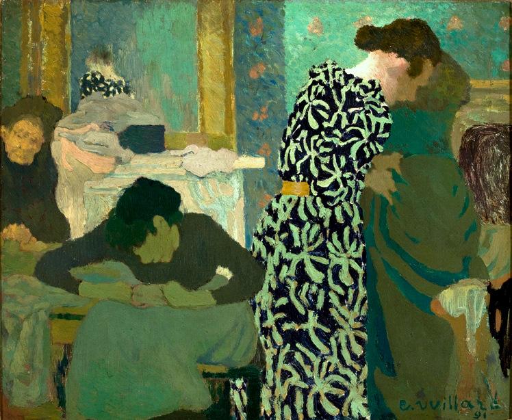
And no one does it better than Tracy Porter, Poetic Wanderlust when it comes to pattern, particularly on crockery! Tracy is a designer after my own heart. I would happily decorate my home with her entire range! She carries pattern through every possible surface imaginable with true aplomb. Definitely worth a look if you are not already familiar with her work.
So go on, explore a little and channel your inner ‘brave’ self.
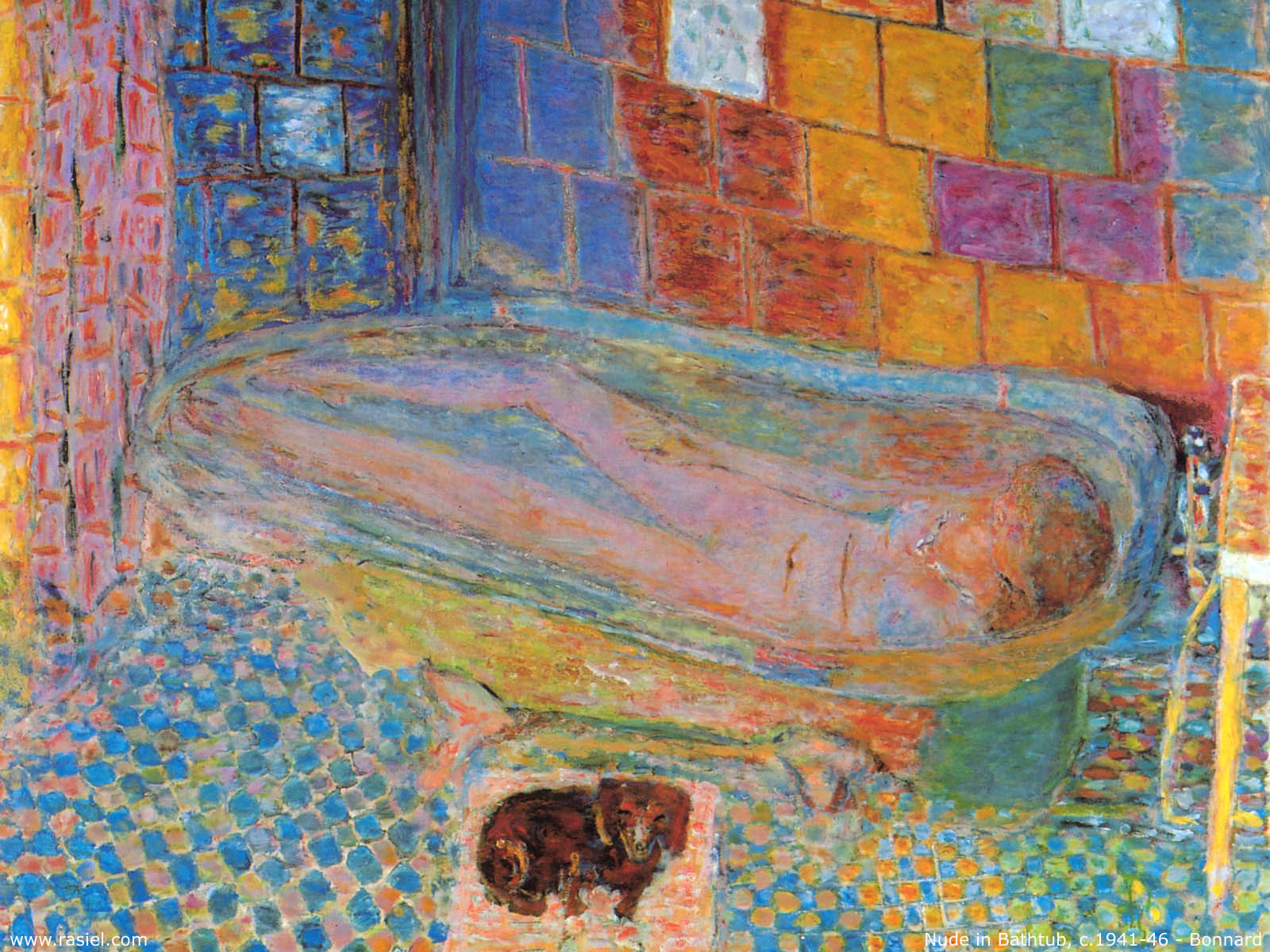
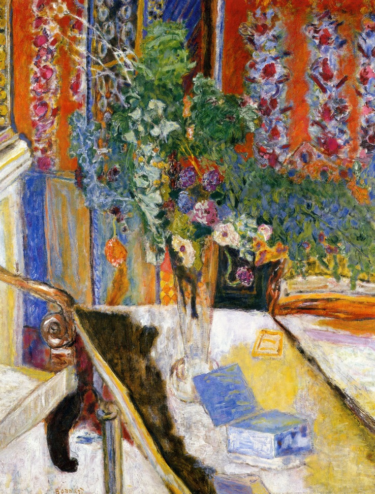
Pierre Bonnard (google images)(www.poeticwanderlust.com)Edouard Vuillard (google images)I heart Tracy Porter.A fantastic source of inspiration… the work of artist Jill Ricci. (jillricci.com)Pattern, colour and texture working beautifully together. (squint limited)Floral heaven (Found on arcademi.com).Just yum. (www.poeticwanderlust.com)Serious pattern clashing, but it works. (www.olyaivanova.com)Edouard Vuillard (google images)Tracy Porter rocks!(http://www.poeticwanderlust.com/inspiration.html)It’s not just about being brave with pattern; be adventurous with texture too. Here we can see orange suede, shot silk, damask and hand-woven material I brought back from Cambodia all working beautifully together. The colour palette is fairly constrained, but the juxtaposition of textures is what brings the excitement. (photo by Chris Gatcum)Pierre Bonnard (google images)I recovered this old wing-back chair I found online in some gorgeous 1950s barkcloth and some donkey-brown velvet. I’ve teamed this with a couple of contemporary print cushions and a cushion I made myself with Lucienne Day-style prints. This colour scheme is predominantly grey, black, and yellow, but I’ve lifted it with the lampshade, which has orange, green and blues in the pattern, and with the orange accent ceramic pieces. (photo by Chris Gatcum)Floor stencilling (blog.freepeople.com).
boudoir. (ˈbuːdwɑː; -dwɔː) 1. a woman’s dressing room, bedroom or private sitting room or salon. [C18: from French, literally: room for sulking in, from ‘bouder’ to sulk]
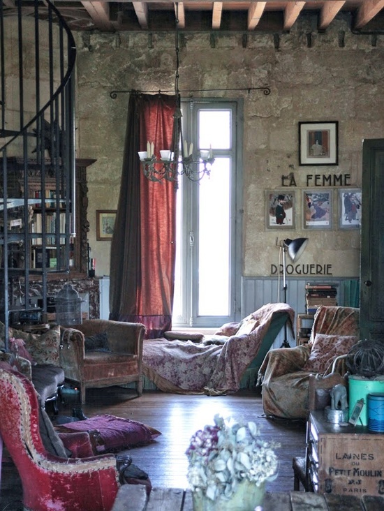
Now the weather is turning decidedly autumnal how about creating a warm and relaxing sanctuary in the home where you can snuggle up with a good book, a hot drink and some cake, or luxuriate in a roll-top glass with some tunes and an indulgent glass of bubbly… I’m in!
For me the boudoir look is all about opulence, texture, pattern, drama, deep rich colours, and some female charm. Lighting is key too. This is a fantastic look to work with in a bedroom, dressing room, powder room or snug. If you are not a fan of bright colours you can always adopt a more sedate palette of nudes, creams, sorbet pinks and chocolatey browns.
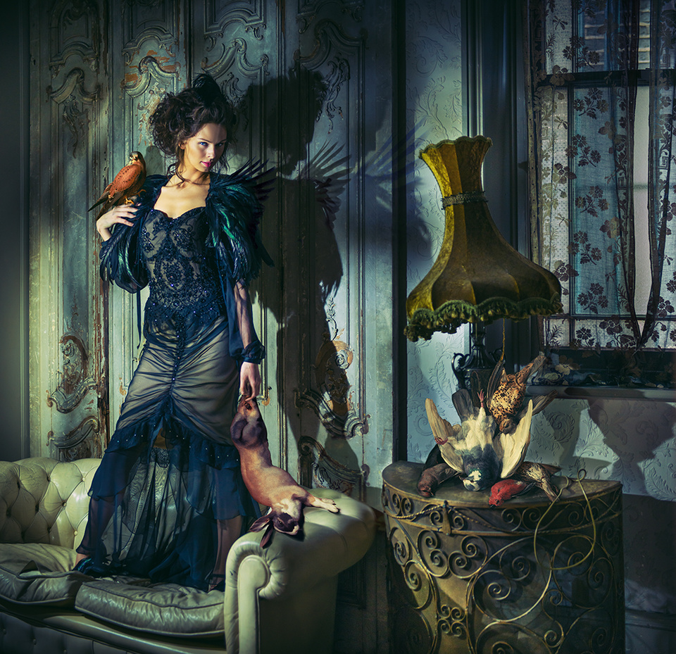
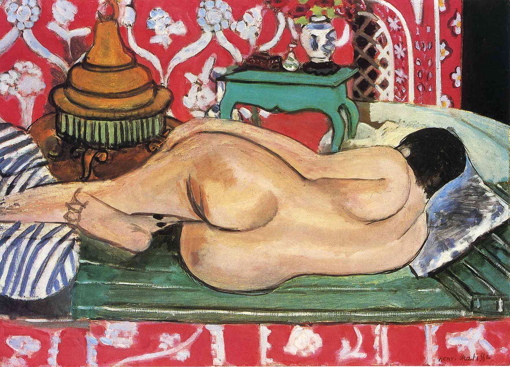
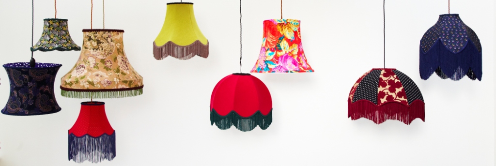
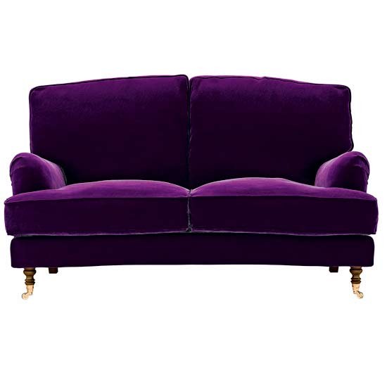
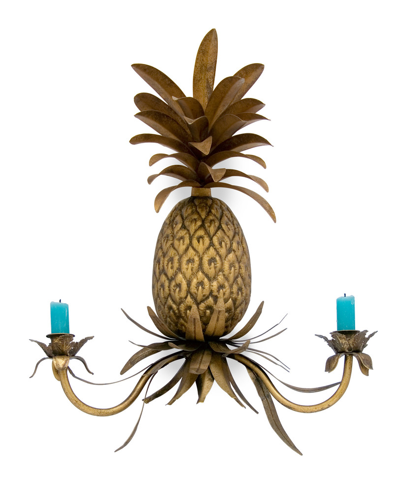
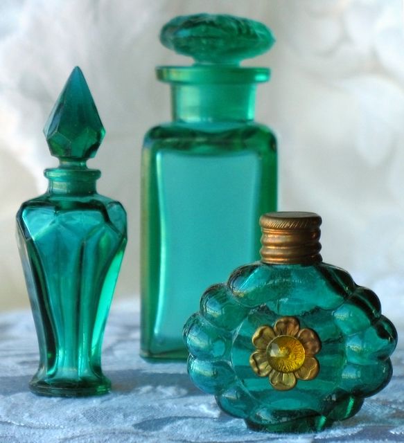
A page from my scrapbook.Getting that boudoir feeling. Another page from one of my scrapbooks.Photographer: Miss Aniela. Series: Surreal Fashion. Model: Faye Shearwood Stylist: Minna Attala. Dress: Busardi. Feather cape:National Theatre Costume Archive. Hair: Doubravka Marcinkova. Make-up: Rhiannon Chalmers. Stylist’s assistant: Becky Smith. Photographer’s assistant: Tim Charles Matthews.More Miss Aniela gorgeousness.Photographer: Miss Aniela / Model: Kim Davis / Dress created by Kirsty Mitchell Photography / Stylist: Minna Attala / Hair: Anne Veck / Makeup: Grace Gray / Photographer’s assistants: Greg Sikorski, Matt Lennard, Ian MearsSomewhere to recline with a glass of fizz. (image from pinterest)Grab a book and doze in this delightful space. (pinterest)A dressing room fit for any discerning boudoir fan. Loving the lampshade by Zoe Darlington. (Image from Pearl Lowe’s Vintage book/pinterest)Matisse’s ‘Seville Still Life’. (google images)Matisse’s ‘Reclining Nude Back’. (google images)Sumptuous lighting design by the extremely talented Zoe Darlington. Lush! (www.zoedarlington.co.uk)More yumminess from Zoe Darlington. (www.zoedarlington.co.uk)The Bluebell sofa from sofa.com.Waterblooms Crewelwork Rug by anthropologie. (www.anthropologie.com)Inject some colour into your scheme with the Maud Deco by Mols & Tati-Lois. (Photo by Chris Gatcum)The Club Tartan from Mols & Tati-Lois. (Photo by Chris Gatcum)Pineapple wall sconce from http://www.abigailahern.com.Anthropologie’s Nature Table Dessert Plate… perfect for eating cake off. (www.anthropologie.com)Elegant perfume bottles are a must. (fredmiranda.com)The bubbly is beckoning… so let’s get supping. Enjoy. (pinterest)
The work of the extremely talented artist/photographer, Miss Aniela, encapsulates the boudoir look perfectly in my opinion and she adds a healthy injection of attitude. A very modern boudoir I would say.
Think lush fabrics such as velvet combined with sheers, fresh flowers releasing a heady aroma, ornate mirrors, furniture to recline on (sofa.com has some beautiful customisable sofas), pattern clashing, flamboyant lighting (visit Zoe Darlington, she rocks, and of course Mols & Tati-Lois), beads, tassels, fringing, dark corners, rugs, throws, cushions, arresting wall art.
There’s so much scope with this interior style so let your imagination run wild.
Breathe some life back into a sad-looking charity-shop find and create a stunning conversation piece for your home.
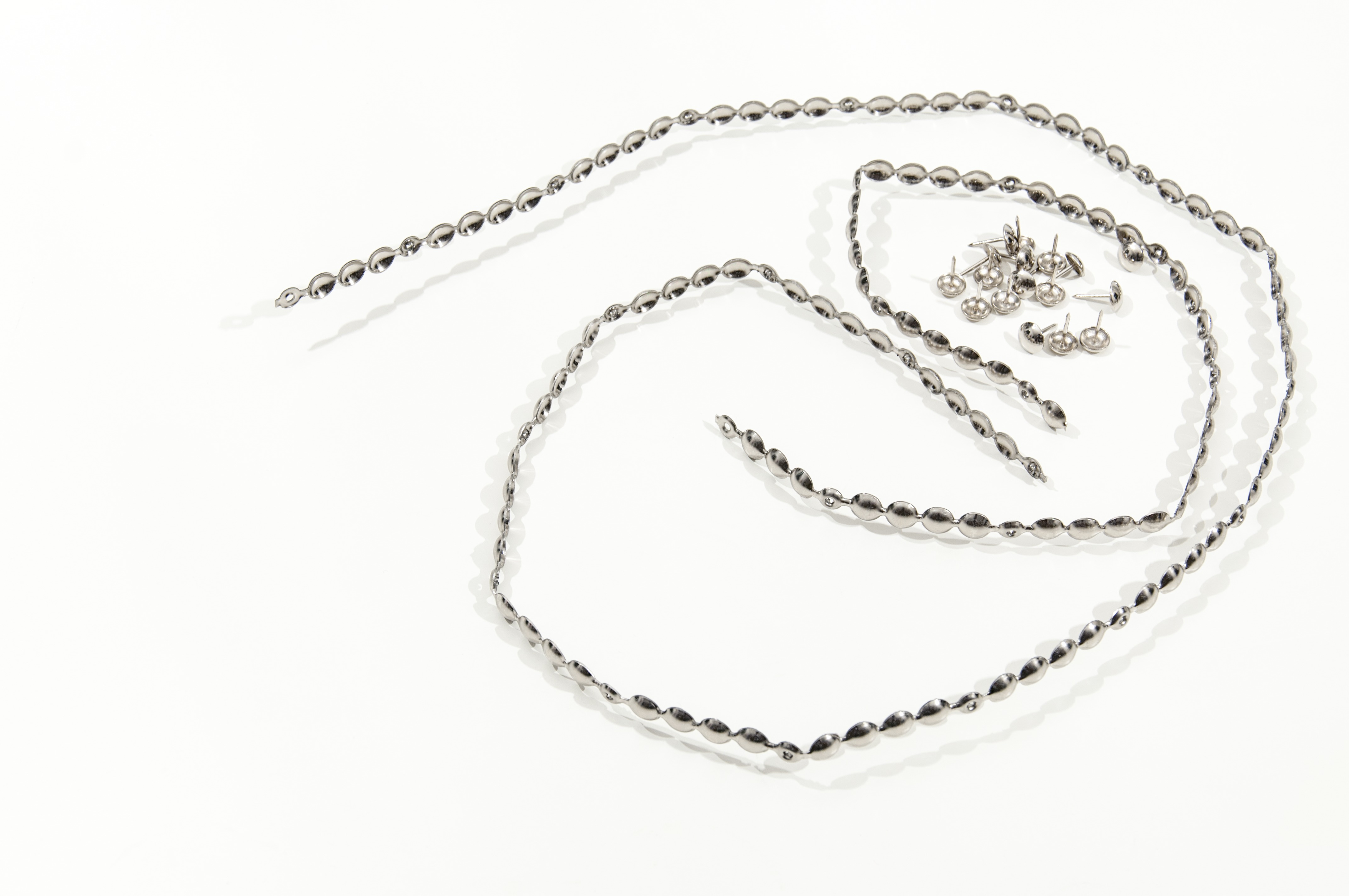
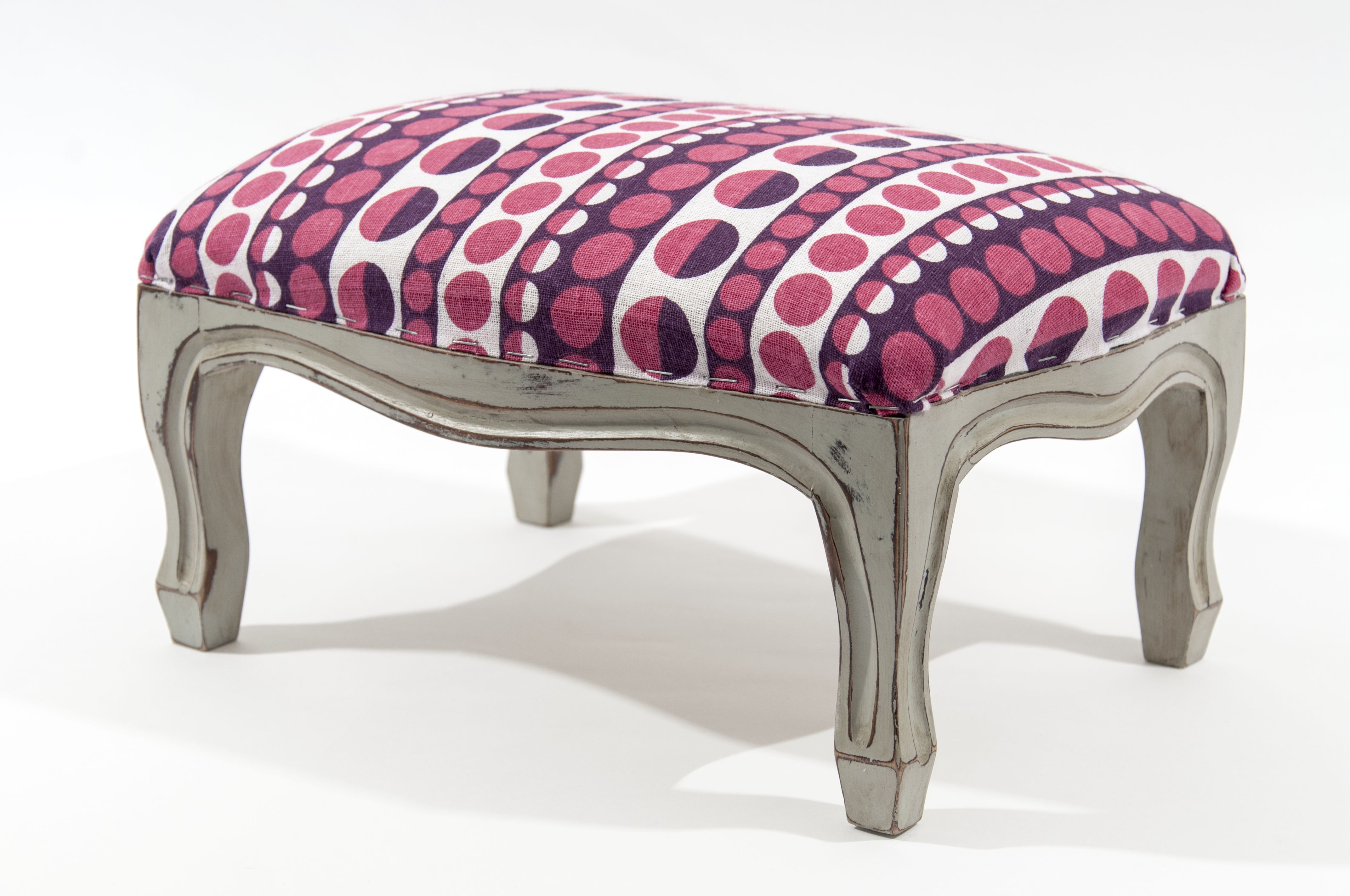
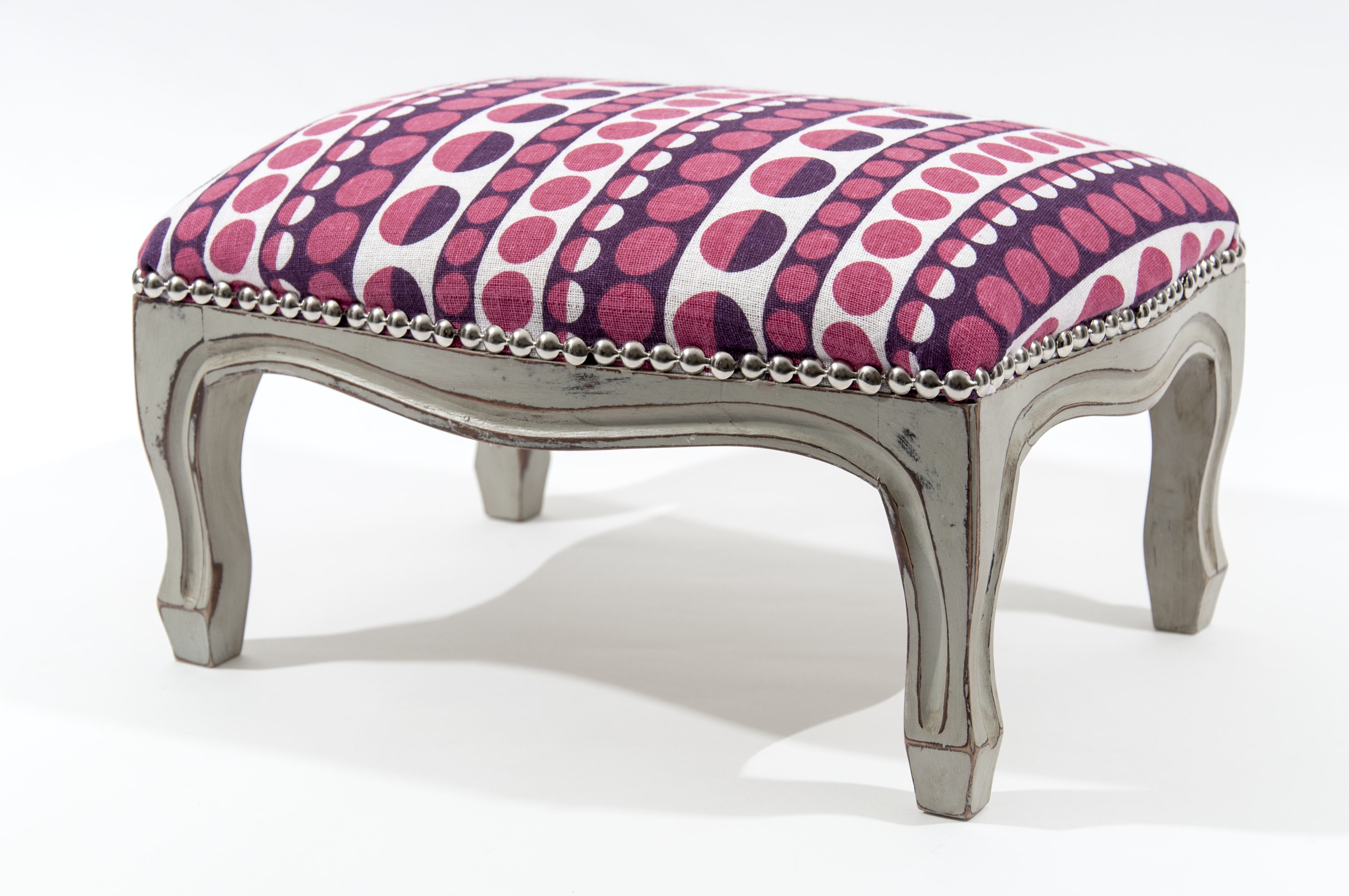
Today I am going to show you how to quickly and easily transform a tatty old foot stool into a quirky, unique object of beauty for the home. A foot stool makes a great little punch of detail in a room if you don’t feel confident yet to reupholster a whole chair or sofa. Kids love sitting on them too! So let’s get creating… I hope you enjoy it.
What you will need:
-A foot stool
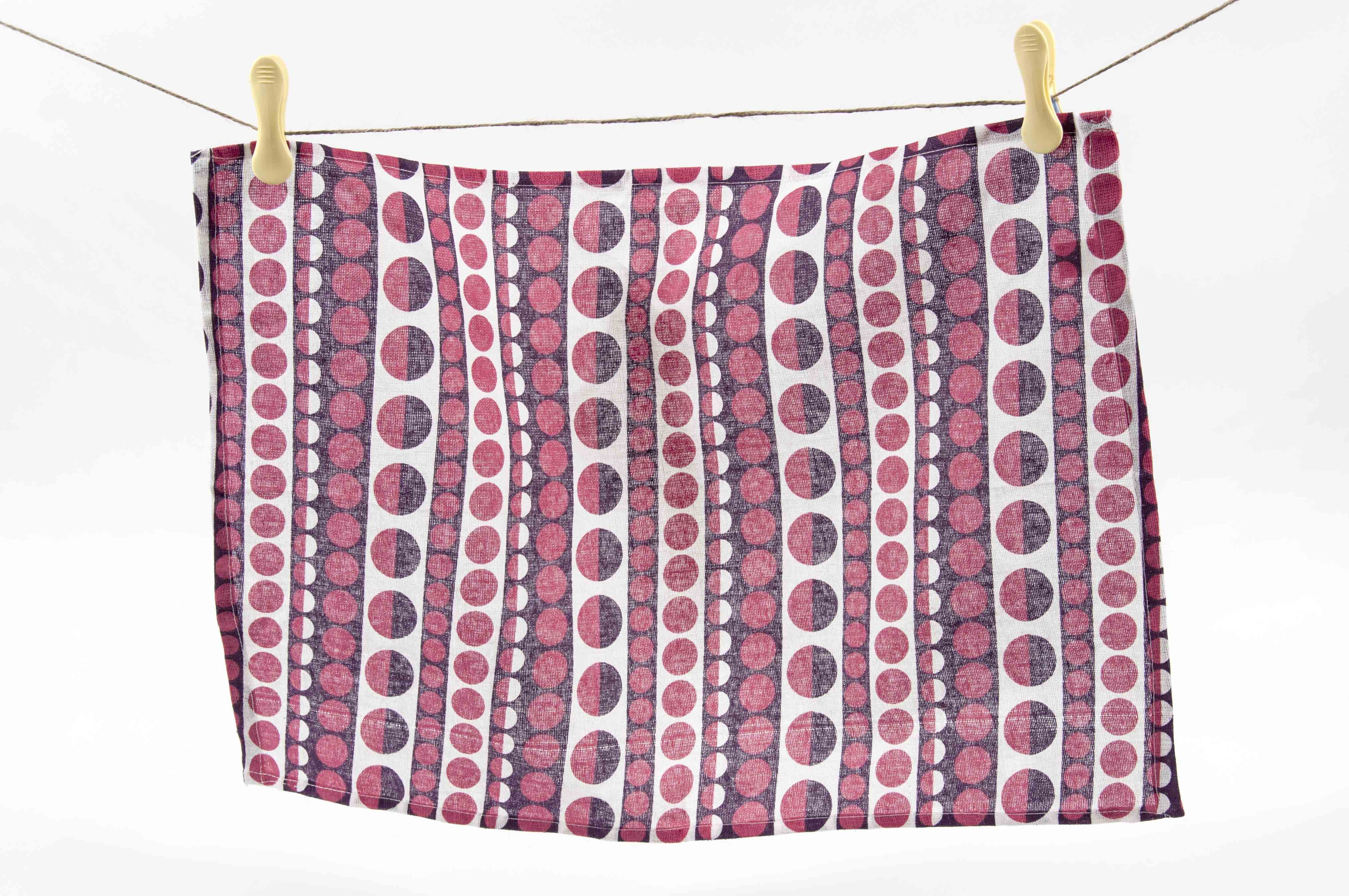
-Fabric
-Staple gun plus staples
-Hammer
-Pliers
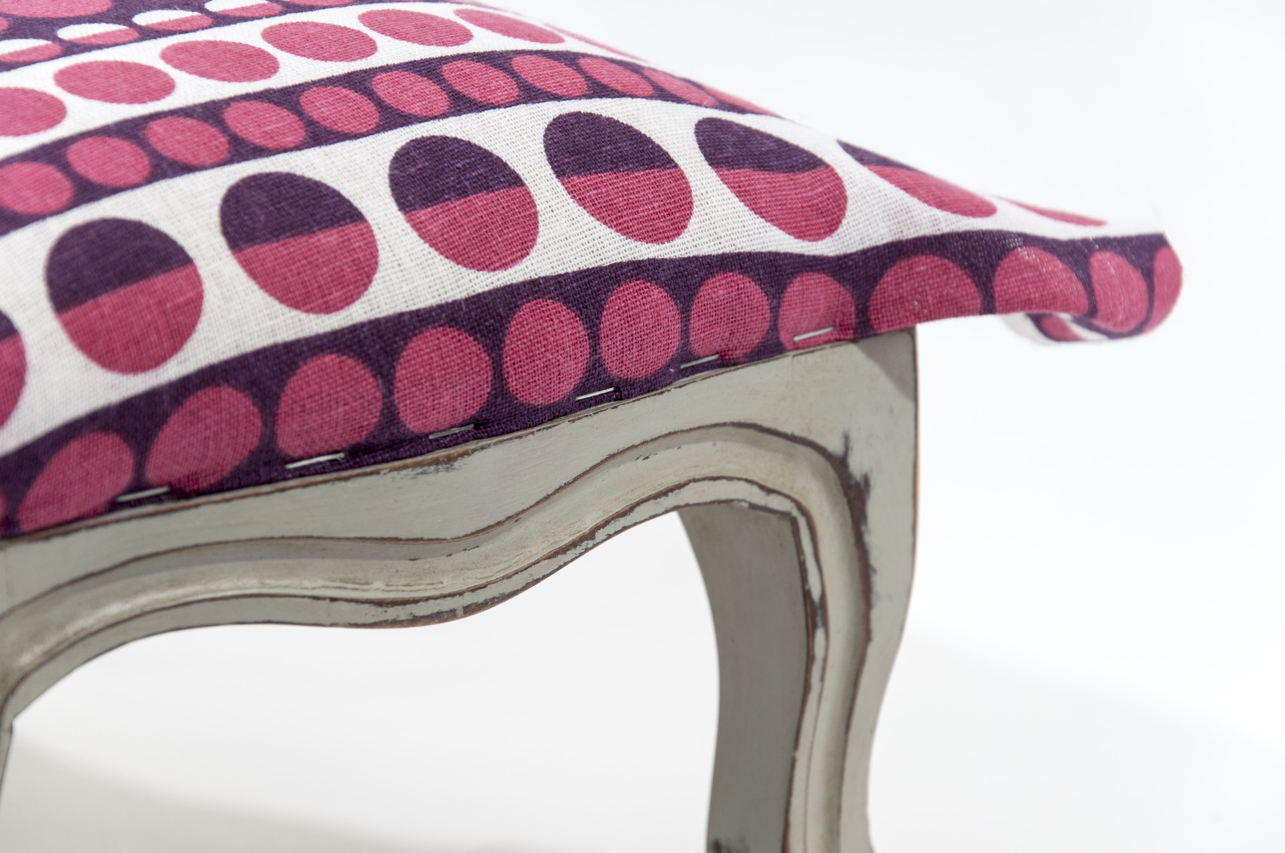
-Upholstery tack strip trim plus tacks (you can use just standard tacks, but strips save time)
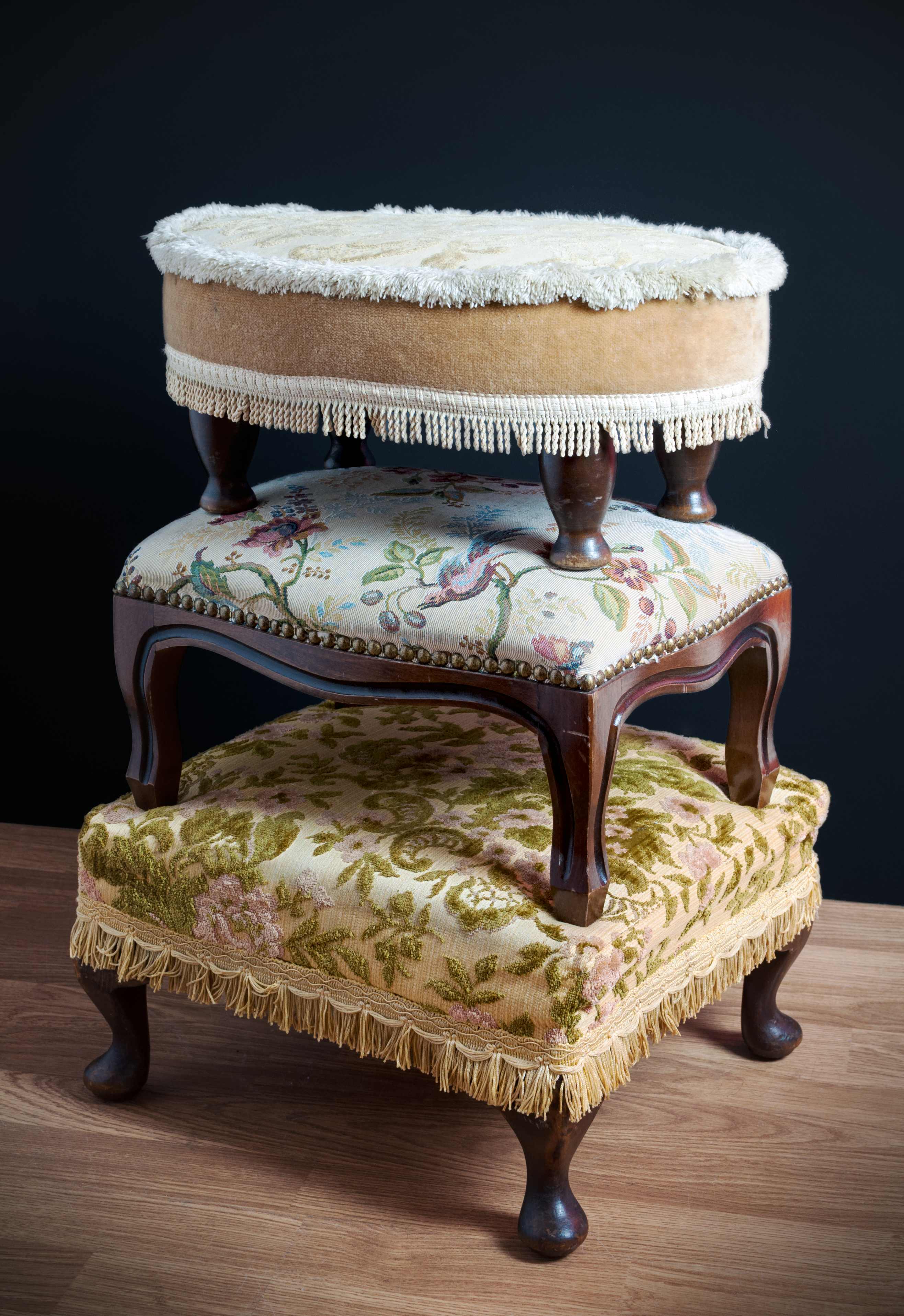
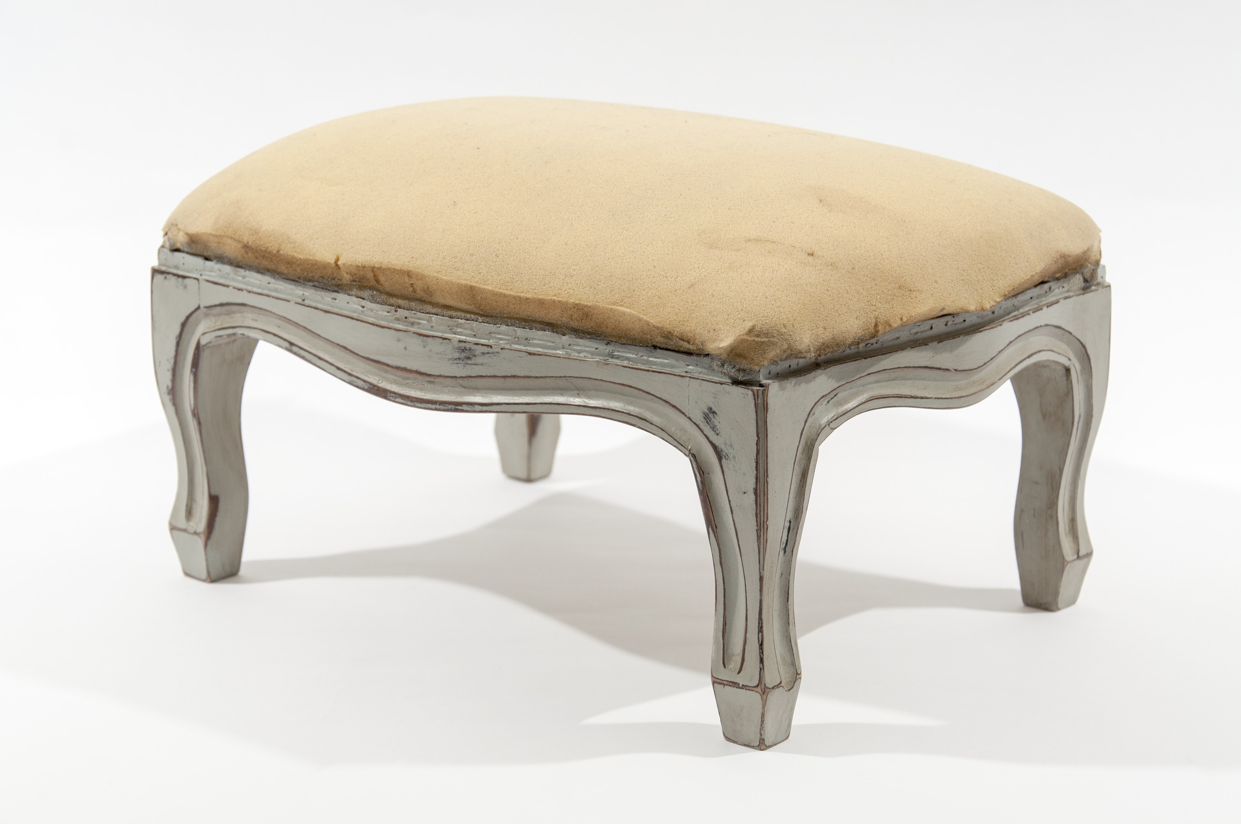
Step 1: A tower of foot stools. What the foot stool looked like originally.Step 2: Original foot stool stripped of old fabric and any tacks and staples, and with legs already painted, distressed and waxed.Step 3: The length of upholstery tack strip needs to be long enough to work around the whole of the edge of the top of the foot stool.Step 4: You will need sufficient fabric to cover the top of the foot stool plus an inch for turnover. I’ve used a vintage-style tea towel to cover this foot stool.Step 5: Start by stapling each edge in the centre point of the fabric, creating a smooth seam by turning the fabric back on itself by about and inch.Step 6: Once you’ve secured each edge you can start stapling along each edge fully. You will need to pull the fabric taut in order to avoid an uneven finish, but do not stretch it so much that you the pattern if the fabric has one.Step 7: Next attach the upholstery tack trim by bending it around the edges of the foot stool to cover the line of staples. Use a hammer and watch out for your fingers!Step 8: The finished foot stool transformed into something really rather lovely. Definitely something to be proud of!Alternative trims and finishes: You don’t have to limit yourself to upholstery tacks to finish your foot stool off. Pom poms, braiding, ribbon, and even buttons can be glued or stitched around the edge of your foot stool to cover the staples and create a unique trim. You also don’t need to use one whole piece of fabric. A great way of using up remnants of fabric is create a patchwork foot stool. This is a great way to mix up print styles.The finished stool! A foot stool makes a great little punch of detail in a room if you don’t feel confident yet to reupholster a whole chair or sofa. Kids love sitting on them too!
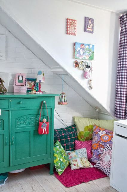
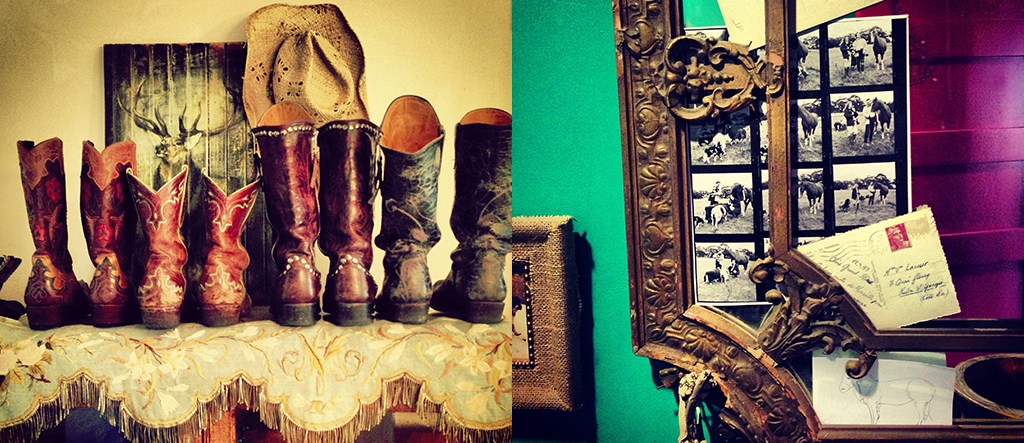
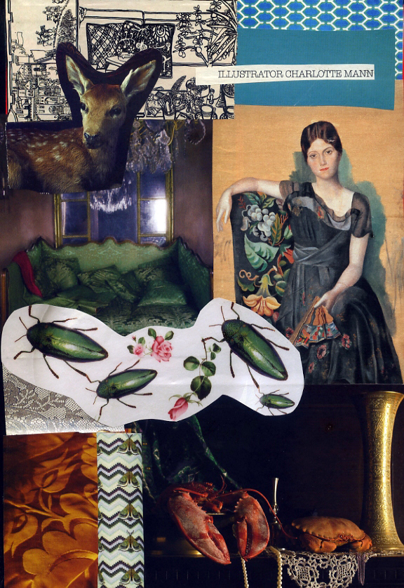
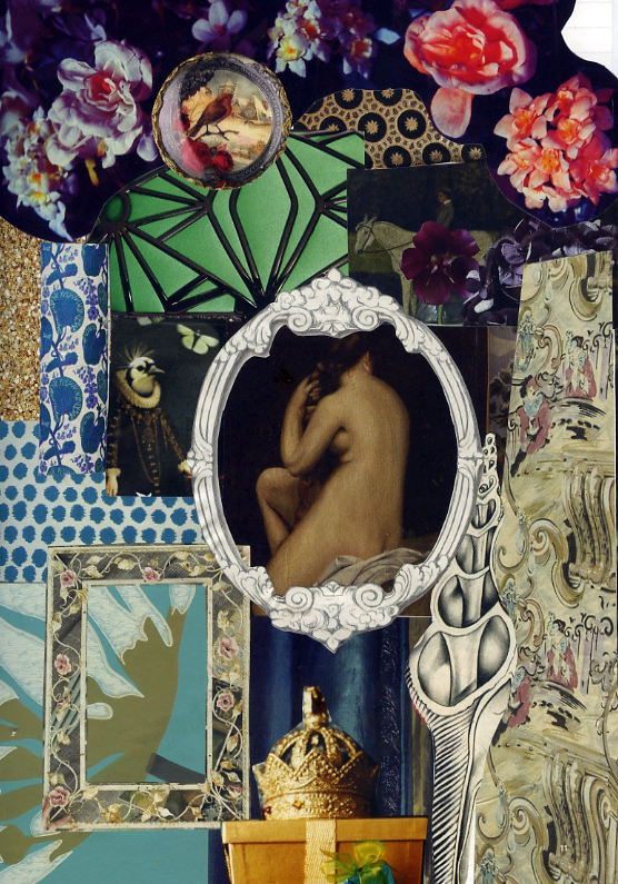
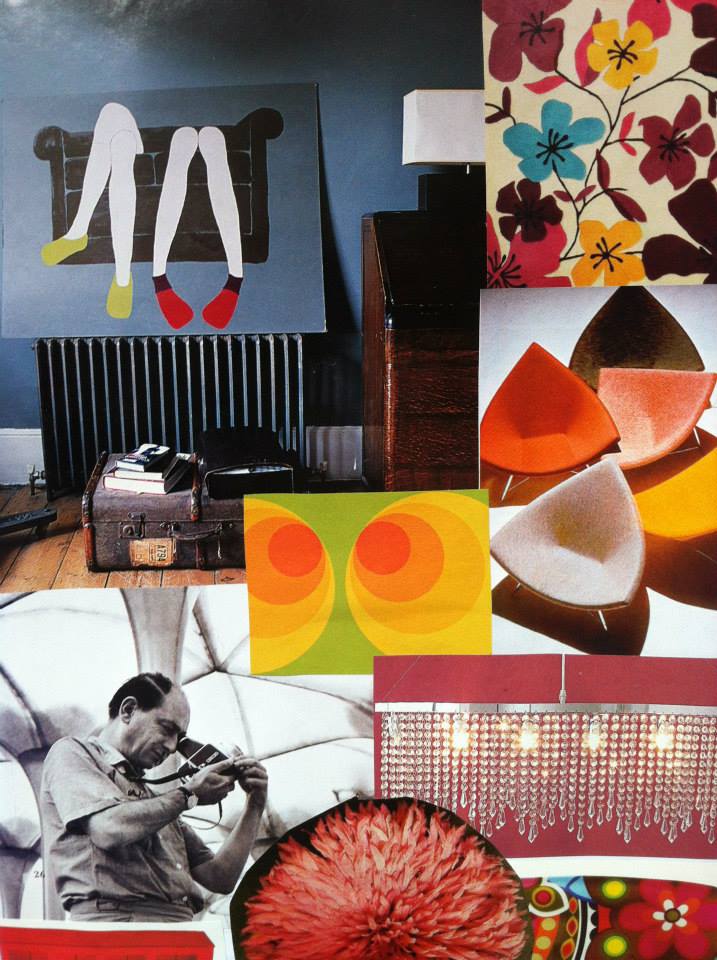
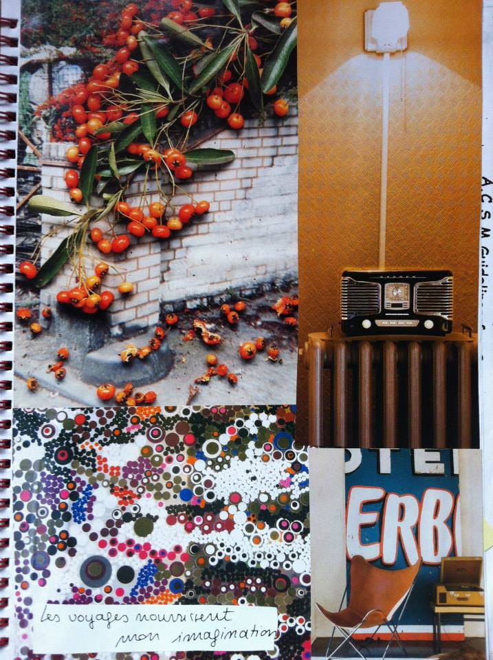
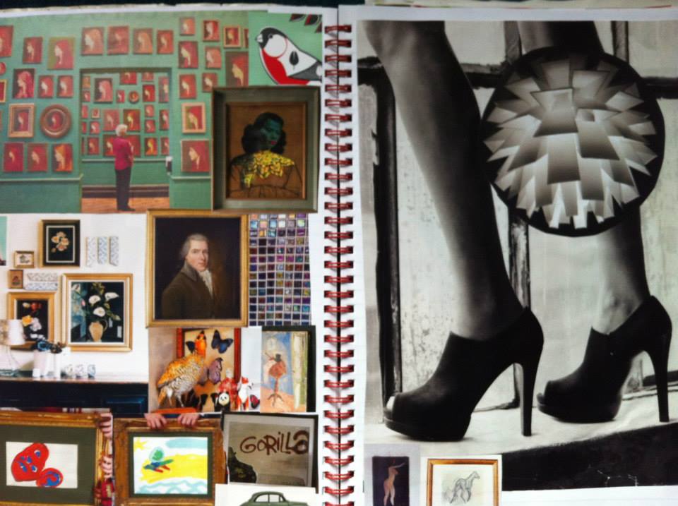
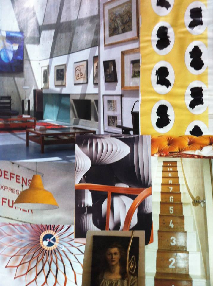
This is my very first personal venture into the world of blogging so please be patient. I have been collecting magazine cuttings, postcards, wrapping paper, and all manner of visual stuff for many many years. It all goes into a box and slowly I create collaged pages in a growing number of scrapbooks. I do this purely for pleasure, however, often the pages of my scrapbooks become a go-to source of inspiration for all the creative projects that I embark on, be that decorating spaces, revamping furniture or making lampshades. I cannot get enough of all things visual. So with this in mind I thought I might start to share things that are exciting me visually. A close friend of mine was blown away when I showed her one of my books and she pretty much ordered me to share it with the world! So humbly, here are some of my scrapbook collaged pages together with other images that have caught my eye today.
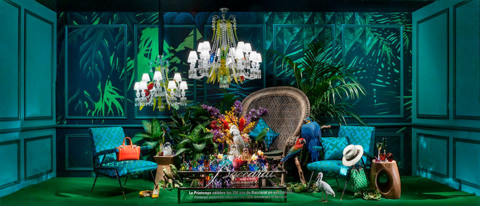
A page from my scrapbook.Orange is one of my favourite colours. This image is incredible. I found it on pinterest.A page from my scrapbook.More scrapbook inspiration.A couple of pages from one of my scrapbooks.Just a great space. (Image from pinterest)Green… another beautiful colour. Combined with lighting, it’s just gorgeous.Just the most incredible styling. I love everything about this space.Cameos with yellow and concrete. Such a great combination.More orange, this time with teal. I am in heaven!