Kitsch (/ˈkɪtʃ/; loanword from German, also called cheesiness and tackiness) is a low-brow style of mass-produced art or design using popular or cultural icons.
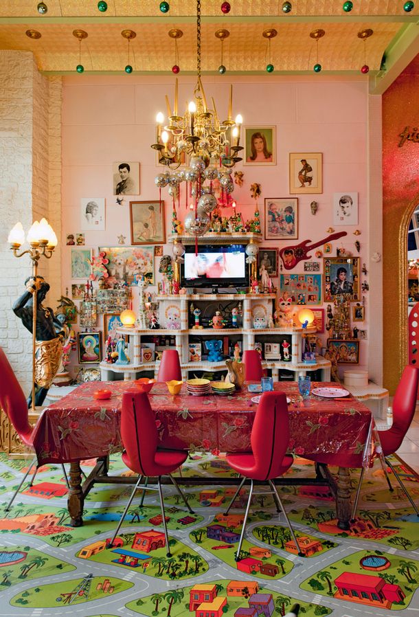
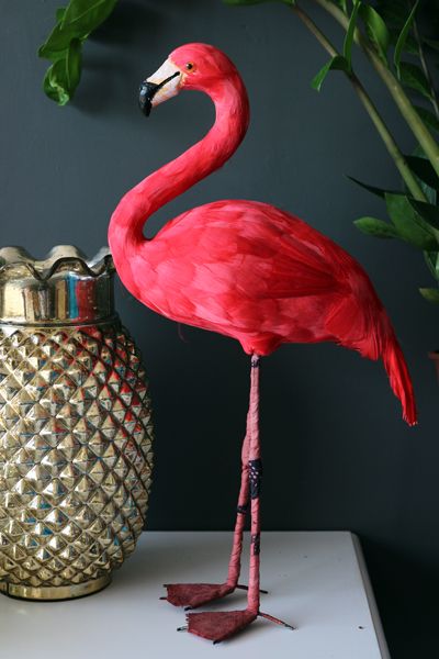
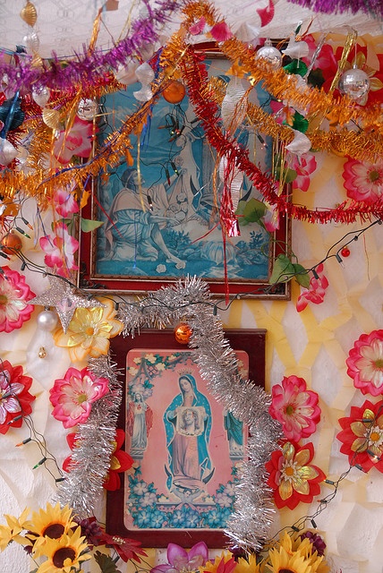
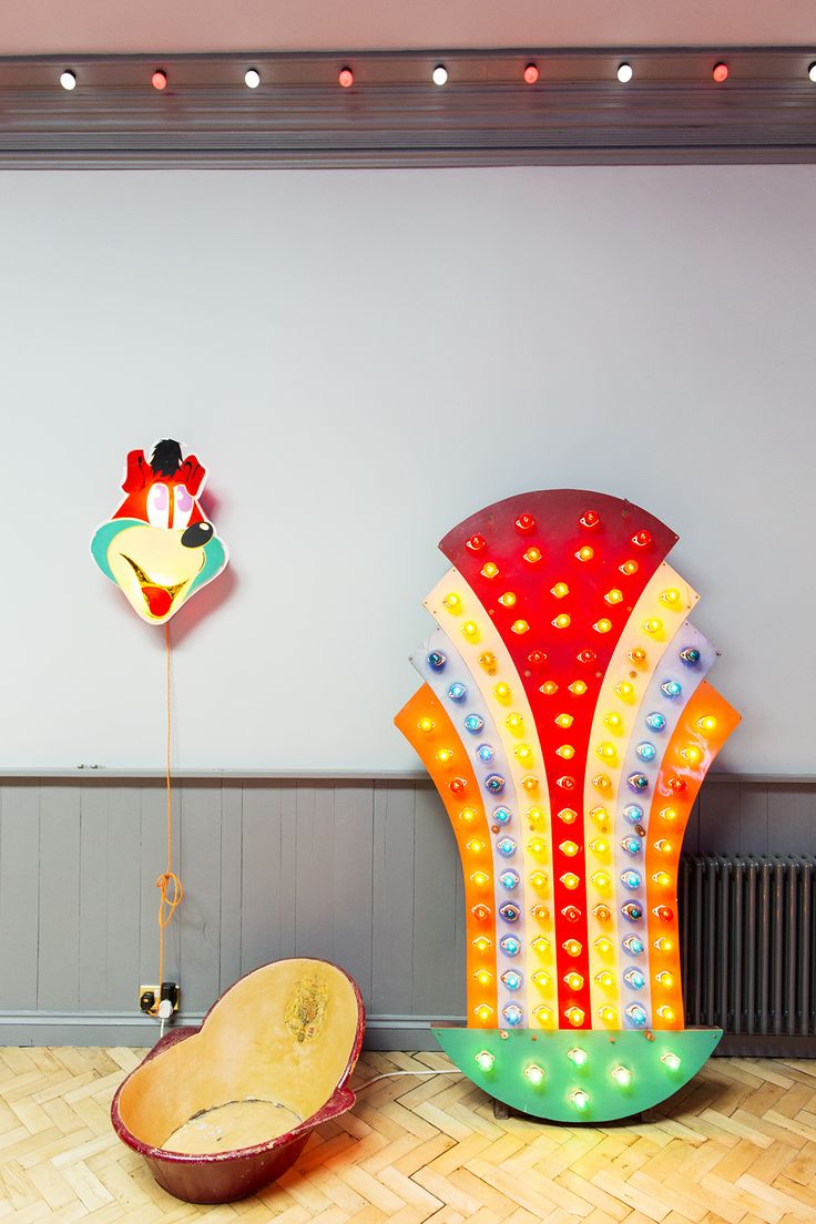
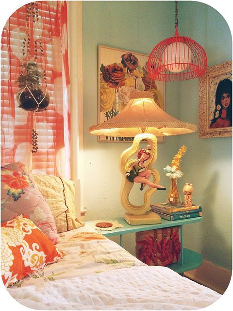
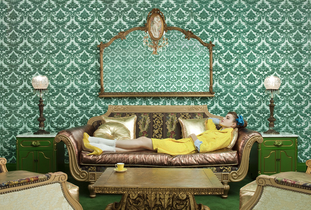
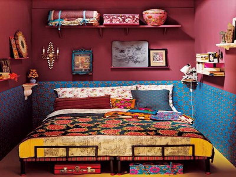
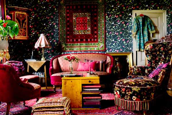
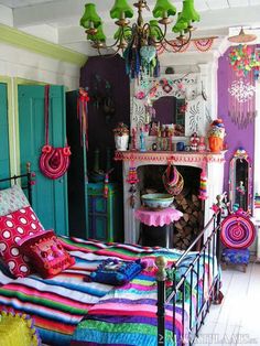
Who doesn’t love a kitsch interior? I can’t get enough of it. I don’t care how naff it is. The naffer the better. Festooned with plastic flowers, pseudo religious iconography – shrines are cool, faux taxidermy, flamingos, neon lights, stuffed animals, cocktail bars, a miami palette, disco balls, and as much paraphernalia of mass-produced popular culture as you can muster.
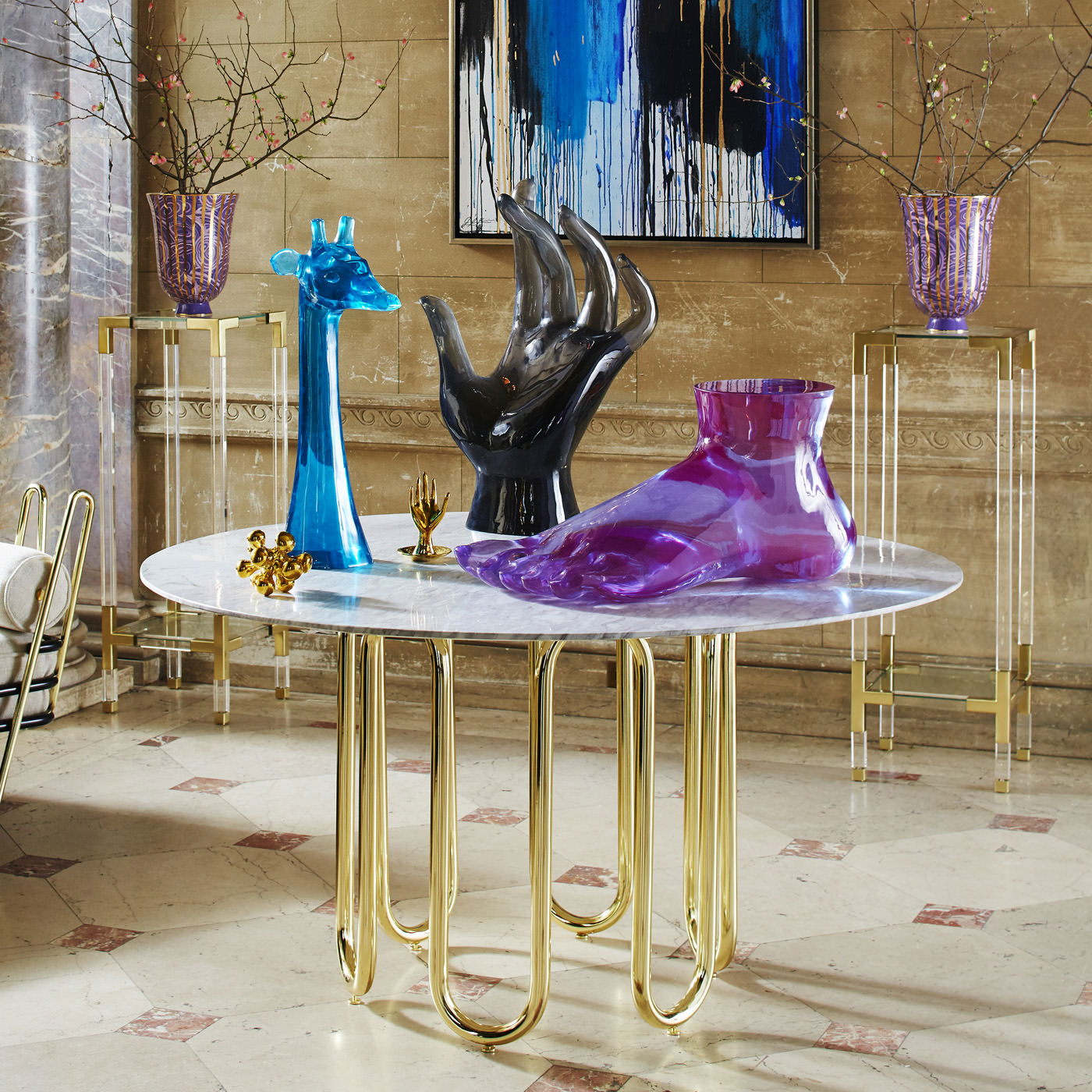
In my opinion the King of kitsch, albeit very tastefully done, is without a doubt Jonathan Adler. With his origins in pottery, Jonathan Adler is now an iconic interiors brand and worldwide phenomenon. The man himself is potter, designer, author, and personality dedicated to bringing style, craft and joy to your life. “Jonathan’s creativity is fuelled by various sources of inspiration: Mid-century modern, art and global pop culture combine to create the signature Adler aesthetic.” And boy does he pull it off with sophisticated aplomb.
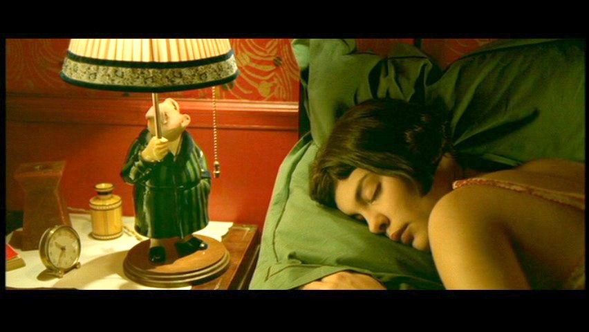
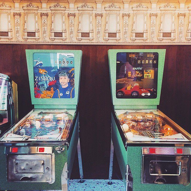
Another great source of inspiration is film. Have a look at the interiors in films by Wes Anderson, Pedro Almodovar, Michel Gondry, and Jean-Pierre Jeunet. Kooky and kitsch in equal measures, these directors have created their own very distinct visual language through the medium of film.
Feast your eyes on all these gorgeous images to get you in the mood for a kitsch-fest.
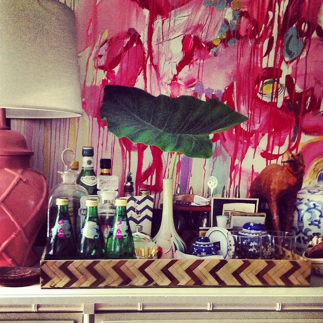
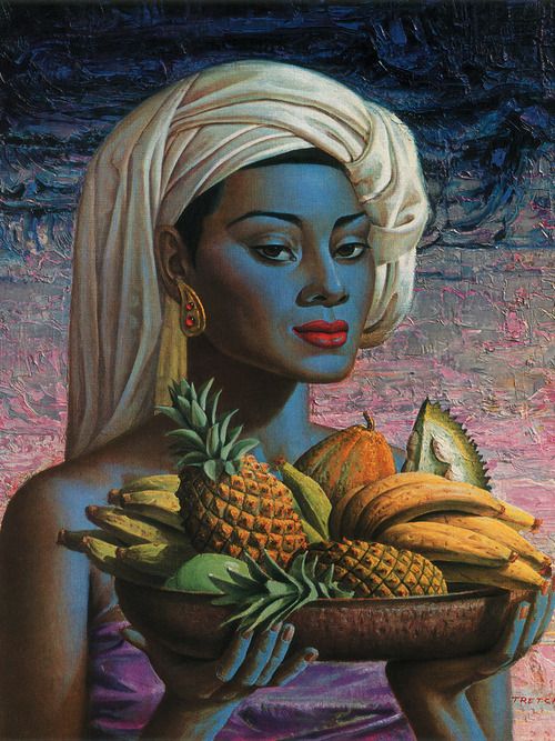
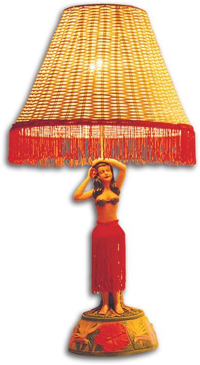
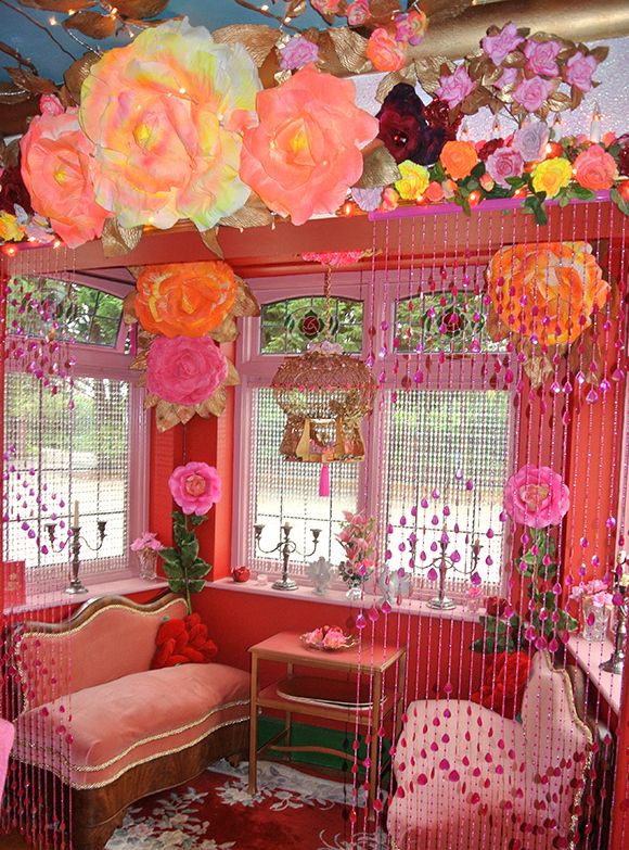
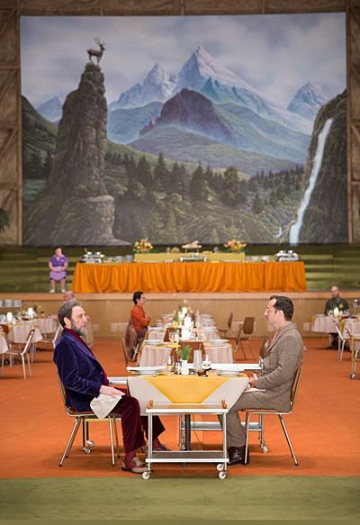
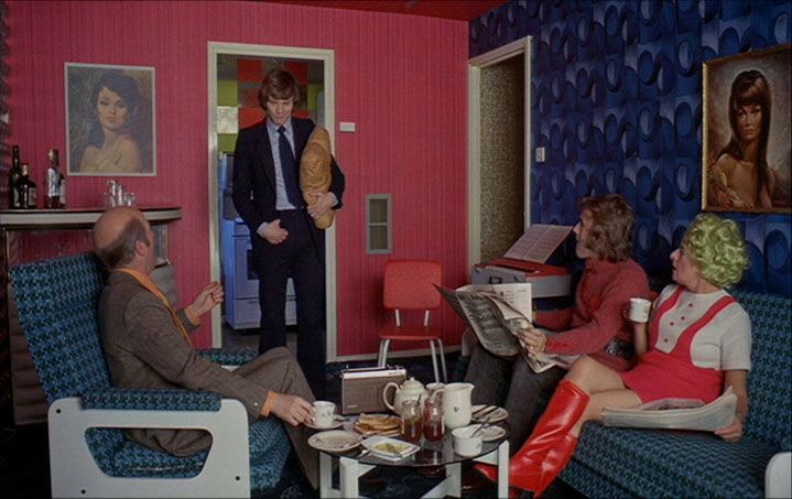
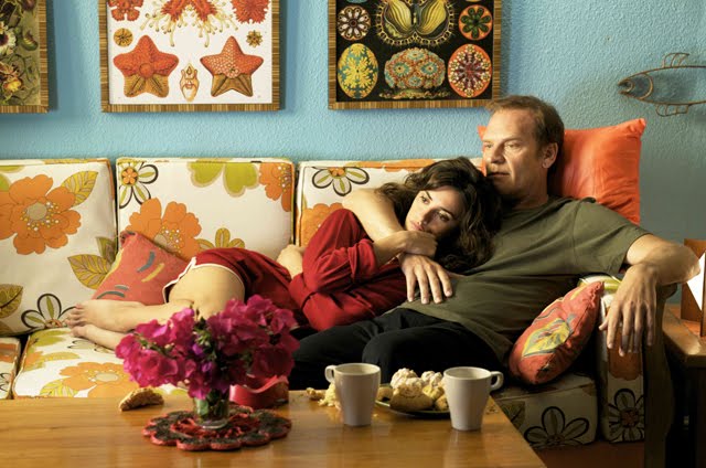
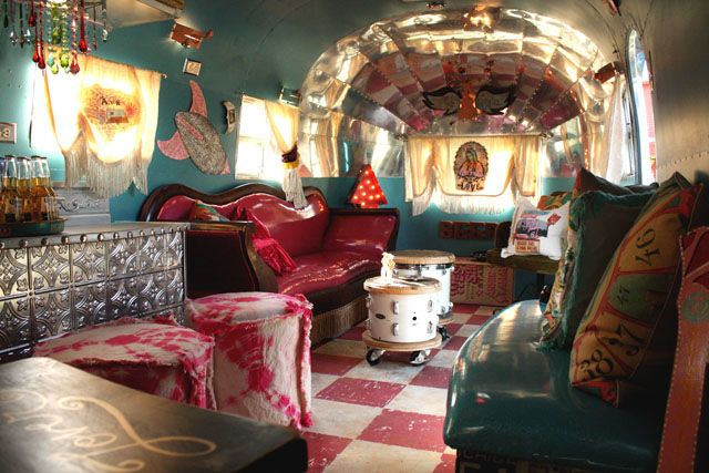
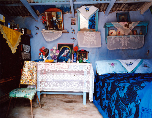
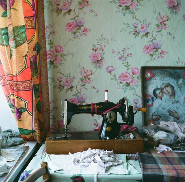
Every home should have a cocktail bar. Furbish Studio, Bar vignette, bar styling, blue and white porcelain, Jamie Meares. Flickr by Jamie Meares. (isuwannee.com)The ultimate in kitsch interiors. Inside the home of artists Gilbert & George. (pinterest)A flamingo is a must! (www.rockettstgeorge.co.uk)Plastic flowers and religious iconography… what’s not to love. Guadalupe Altar outside the home of a fisherman on the Pacific coast of Guerrero, Mexico by Ilhuicamina. (flickr.com)Neon lighting from Oakley Illuminations. (theselby.com)Kitsch-tastic. (pinterest)Vladimir Tretchikoff artwork. (www.vladimirtretchikoff.com/gallery.htm)Oversized ornaments from Jonathan Adler.Every home should have a vintage motion hula lamp. (alohaoutlet.com)Kitsch heaven… not for the faint hearted! (pinterest)The genius that is Wes Anderson. (pinterest)Jonathan Adler’s sophisticated kitsch.A Clockwork Orange film set. (pinterest)On the set of ‘Broken Embraces’ by Pedro Almodovar.Kitsch glamour a la trailor trash. (junkgypsyblog.com)Just because. (urban outfitters)‘Amelie’ screen shot. (pinterest)Wes Anderson-designed cafe, Bar Luca, in Milan. (http://www.dezeen.com/2015/06/07/wes-anderson-designed-bar-luce-takes-cues-old-milanese-landmarks-cafes-fondazione-prada-interiors/)The very cool photographs by actor, director and photographer Aaron Ruell. (http://www.aruell.com/)
a brief evocative description, account, or episode.
“a classic vignette of embassy life”
2.
a small illustration or portrait photograph which fades into its background without a definite border.
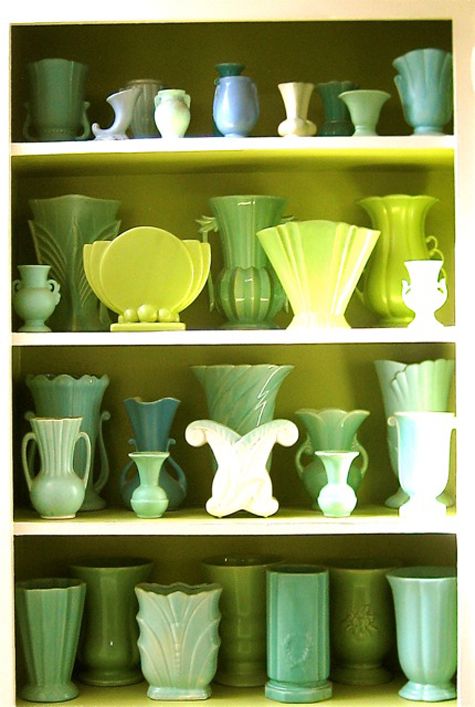
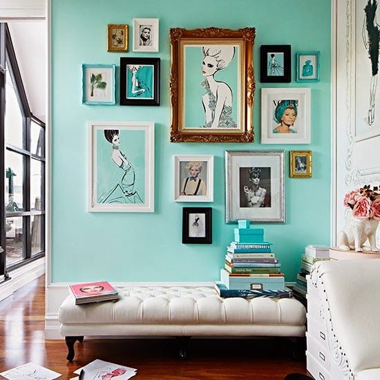
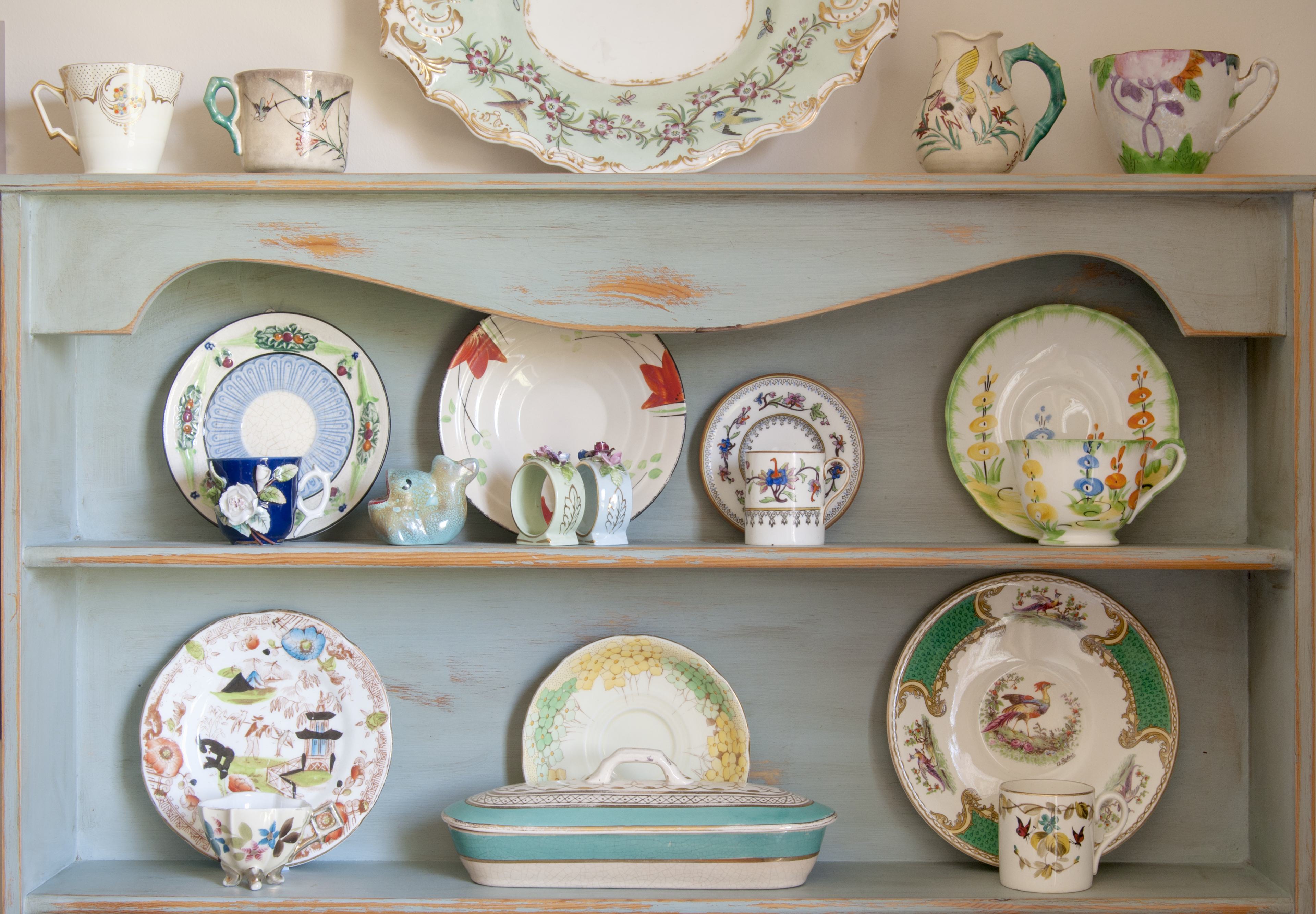
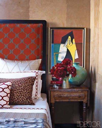
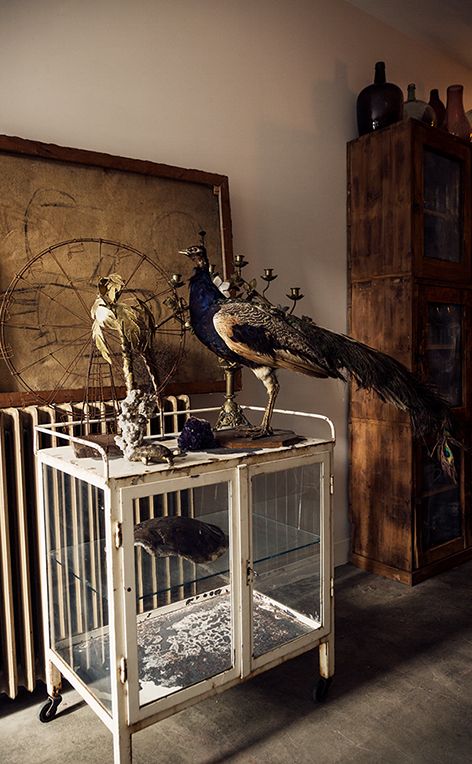
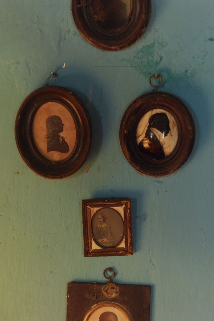
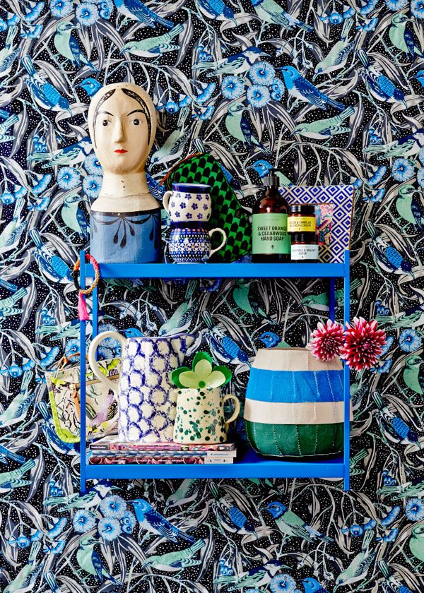
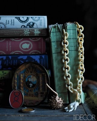
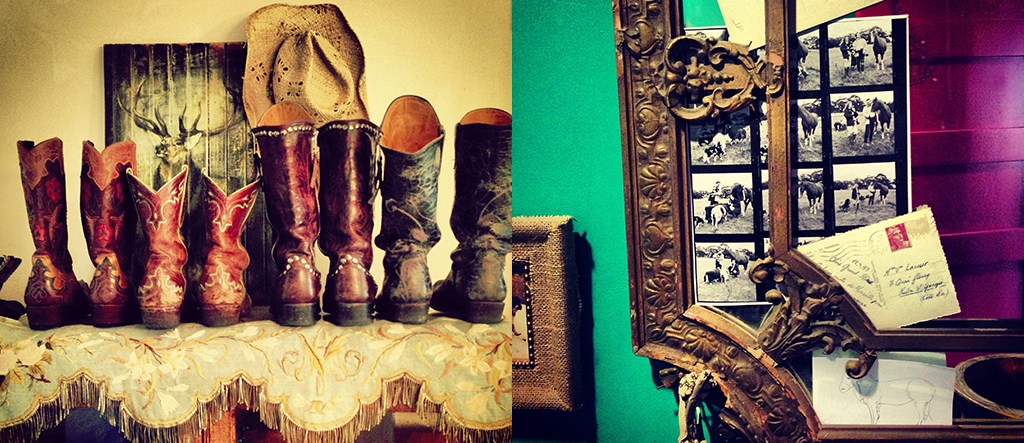
In interior design terms, a vignette is a collection of objects displayed in such a way as to possibly create a ‘story.’ By this I mean the objects on display can go some way as to explain something about the person whose home it is – perhaps they love patterned crockery, or they are a voracious explorer, or they collect art, or they are passionate about shoes…
I am an ardent collector. I always have been. A veritable magpie, I freely admit. Over the years I have collected vintage bottles, coloured glassware, crockery, miniature chairs, postcards, tiles, religious effigies and artefacts, mirrors, brooches, scarves, paintings…and I could go on! And I am a great fan of creating vignettes. There are no hard and fast rules in my opinion, although objects do tend to work better if displayed in multiples of odd numbers. The beauty of a vignette is that you can change it as and when you feel like it. You can become your own interior ‘curator’. Don’t hide your possessions away. They speak volumes about who you are as a person and the experiences you have had throughout your life. I find great comfort in having objects that are dear to me dotted around the house… even if they do collect dust! At a base level they make me smile, and that’s never a bad thing in my book.
Possessions can spark wonderful memories of travels to far-off lands or ‘just because’ gifts from close friends. Why keep them in the loft? So I urge you to unpack your treasures and show them off with pride. There is no right or wrong, as you will see from the visuals that follow. Trust your gut. If you don’t like how certain objects work together, just swap them around a bit. It’s that simple. I particularly love out-of-context displays. For example, at home I have a collection of mismatched cups and saucers in one of our bathrooms just because the colours work well together. And why not…?
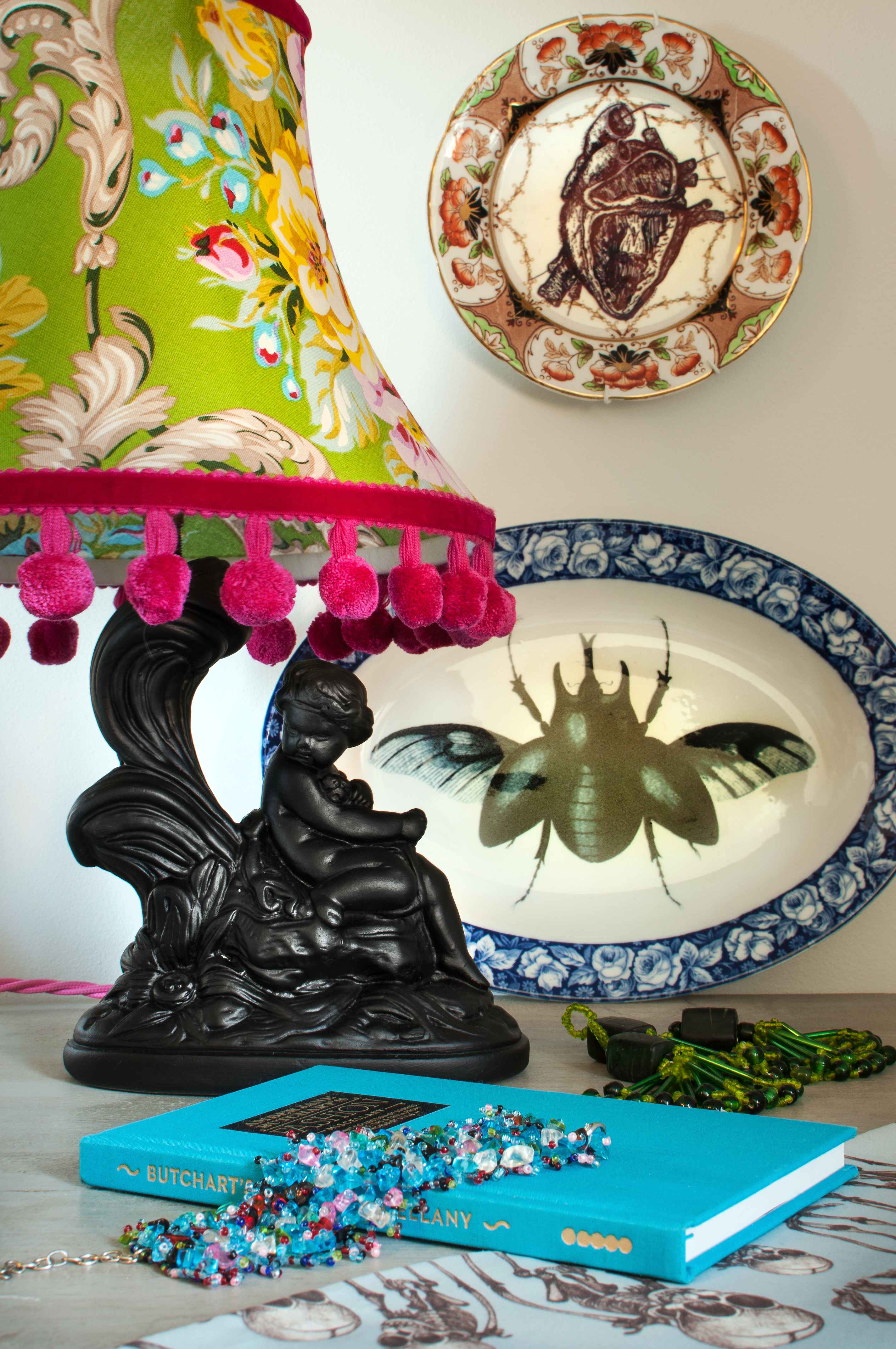
One thing to consider with any form of vignette is how to light it to create the most impact. This type of lighting is what is known as ‘accent’ lighting. You can achieve this by having table lamps dotted around next to any vignette you’ve created, or you could have directional lighting so you can angle lighting in a specific direction. Again, experiment to find out what gives the best end result. In my book a vignette should always have an edge of drama and that’s where the lighting can come into full effect. So go forth and rustle up a little bit of theatre in your home. I promise you’ll be hooked in no time!
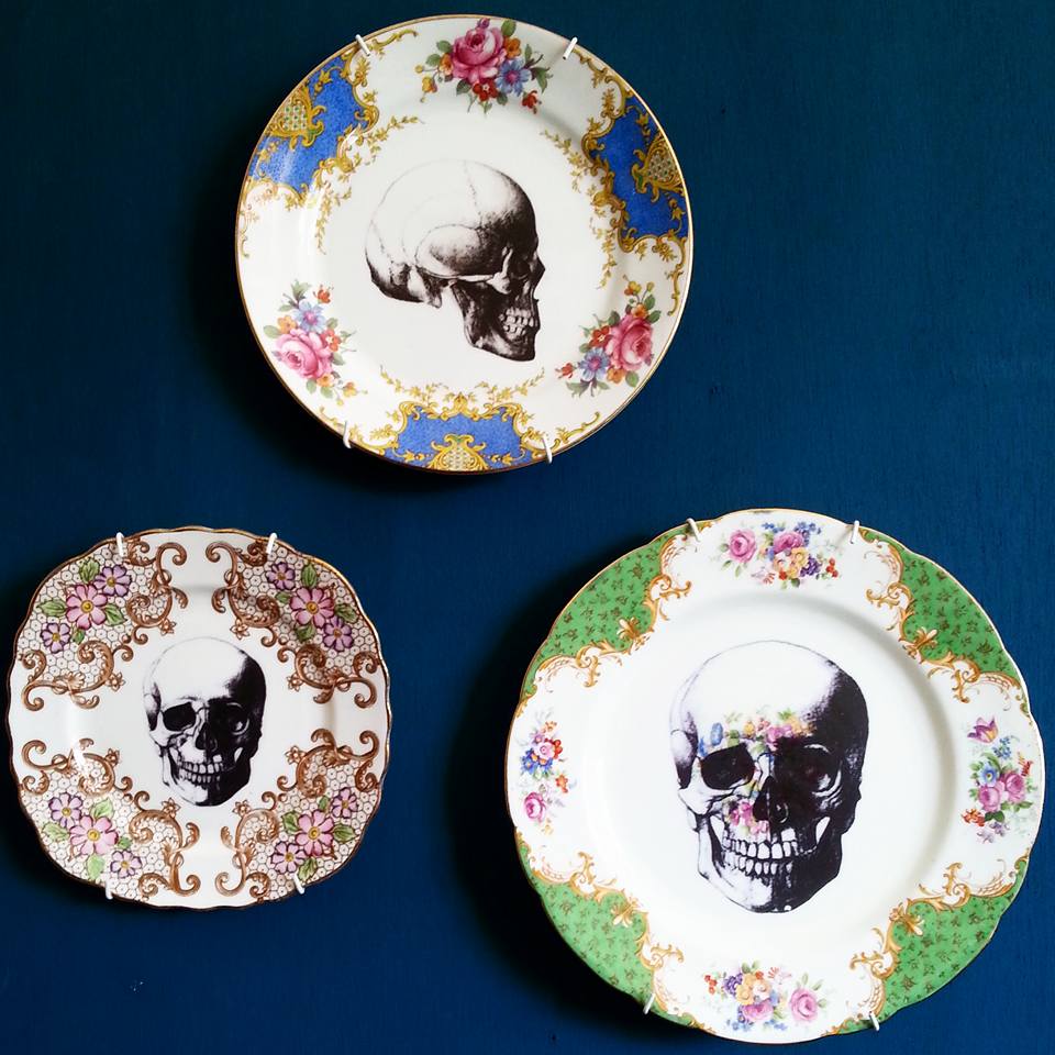
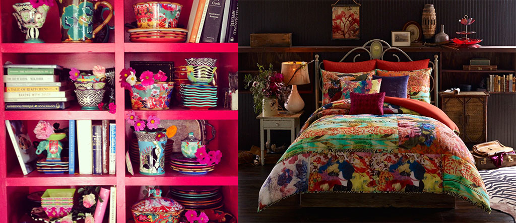
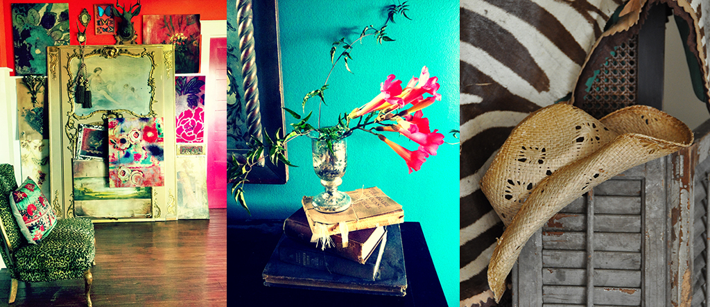
Use colour boldly and don’t be afraid to layer. Interior Color. Jasmine Wallpaper from Farrow Ball | Avenue Magazine (thedesignsheppard.com)Create a wall display with pinned cuttings. (shabbychicgirls.blogspot.com)Display objects of a similar colour. Here vintage pottery vases work beautifully together. (binkandboo.net)Create gallery walls with groups of artwork. Here the different-sized pictures hang together beautifully on the solid-coloured background wall. (dailydreamdecor.com)My collection of cups and saucers in one of our bathrooms. (Photo by Chris Gatcum)Pattern-clashing vignette. You can create a vignette from pretty much anything. (garoopatternandcolour.tumblr.com)A bedside table can double up as a tiny ‘gallery’ space. (elledecor.com)Vignettes can be dramatic and unusual. (scotch-collectables.com)Consider carefully how you light your vignette. Here a feature table lamp has been incorporated into the display. (Lampshade by http://www.molsandtatilois.com / Photo by Chris Gatcum)And why not hang clothes on the wall. (desiretoinspire.net)Crockery can be very effective as wall art. (independent.co.uk)Pile shelves with curios and emulate an apothecary cabinet. (homelife.com.au)One can never have too much glassware! Brabourne Farm (brabournefarm.blogspot.com)Small cameos work well clustered together. (toast.co.uk)Collections can be totally random. They still hang together beautifully. Photo – Sean Fennessy, styling – Lucy Feagins (thedesignfiles.net)Books with interesting spines always work well. So too do trinkets and favourite pieces of jewellery. (elledecor.com)Throw colour at a vignette. (Lampshade by http://www.molsandtatilois.com / top plate by Remnant Black / bottom plate by Wild & Violet / Photo by Chris Gatcum)Open shelves in a kitchen are a great way of showing off beautiful crockery and glassware. (gypsypurple.blogspot.com)
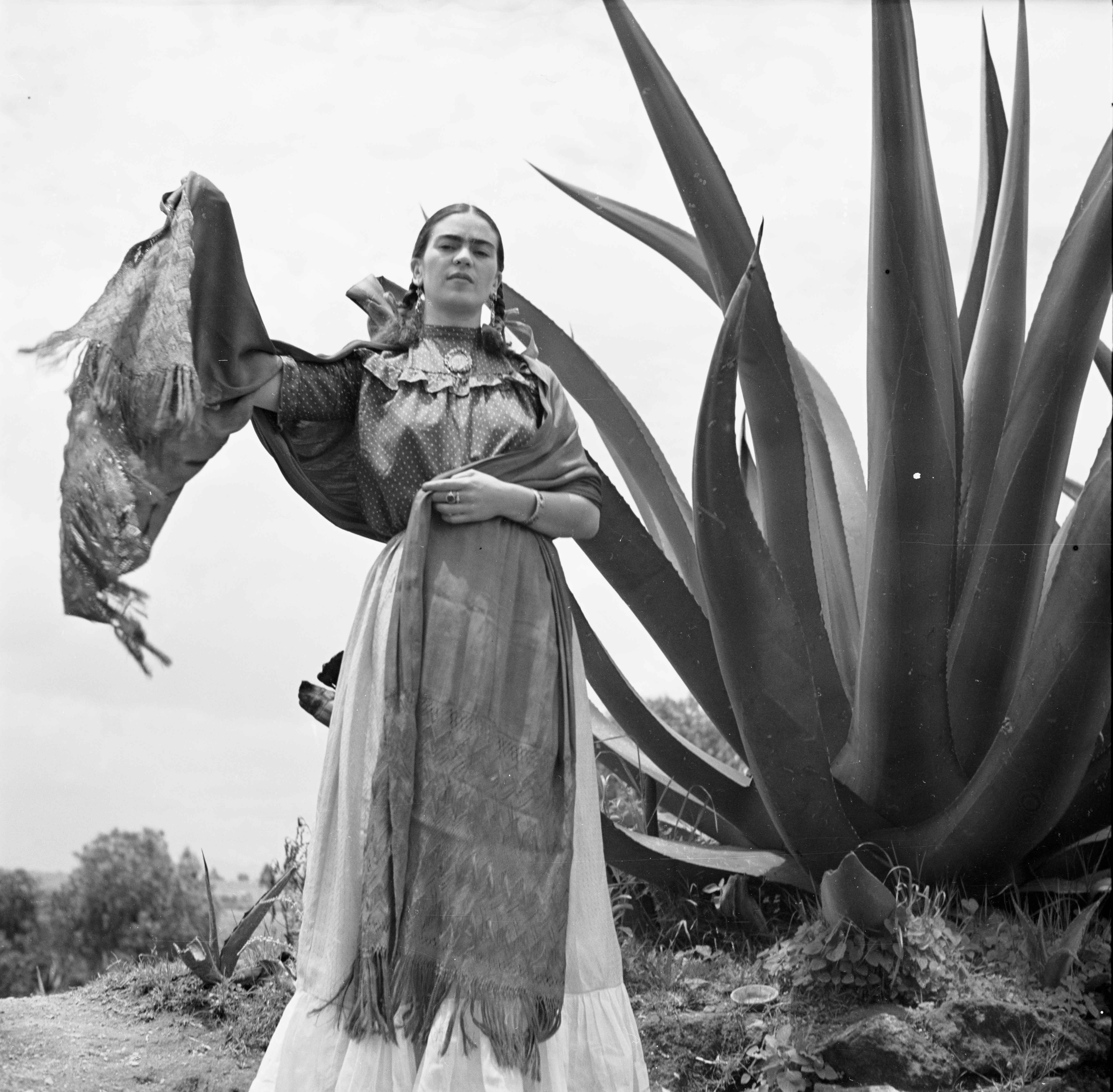
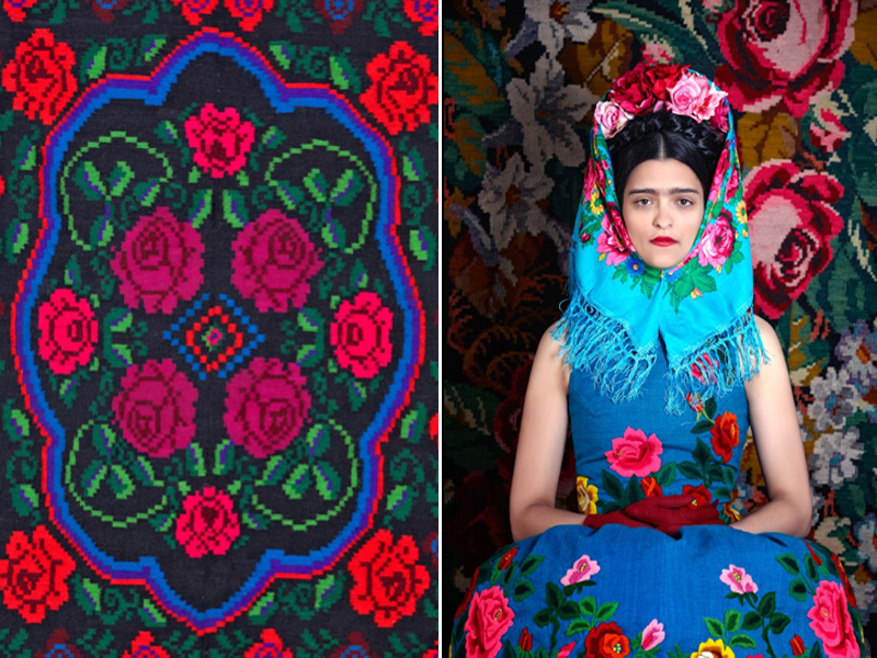
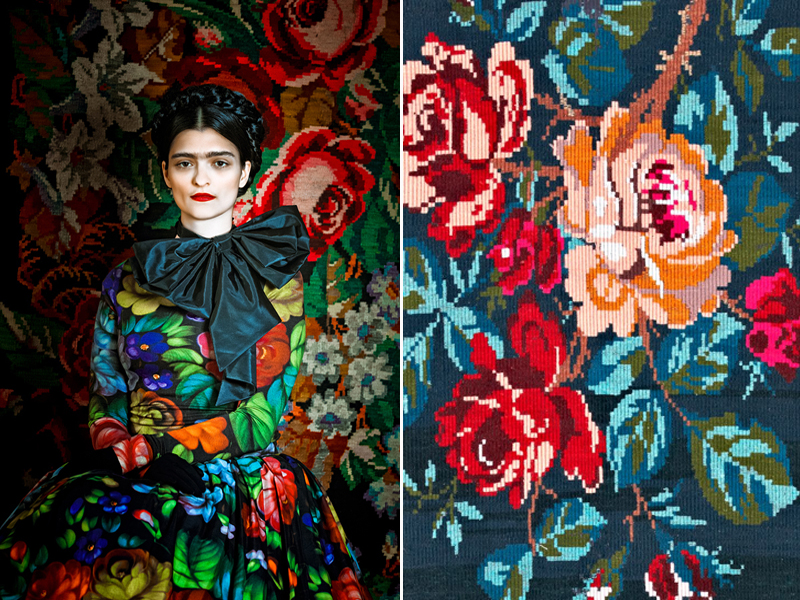
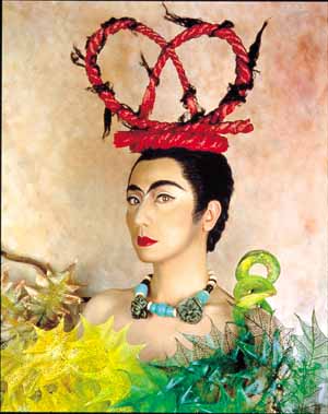
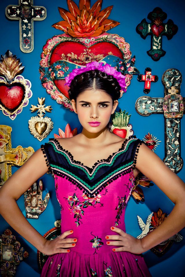
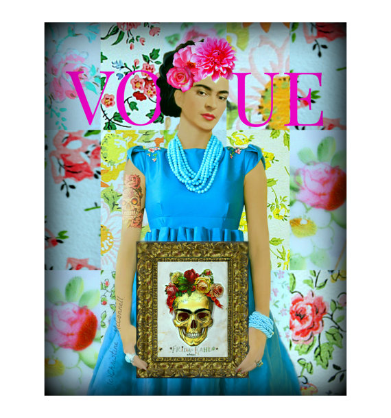
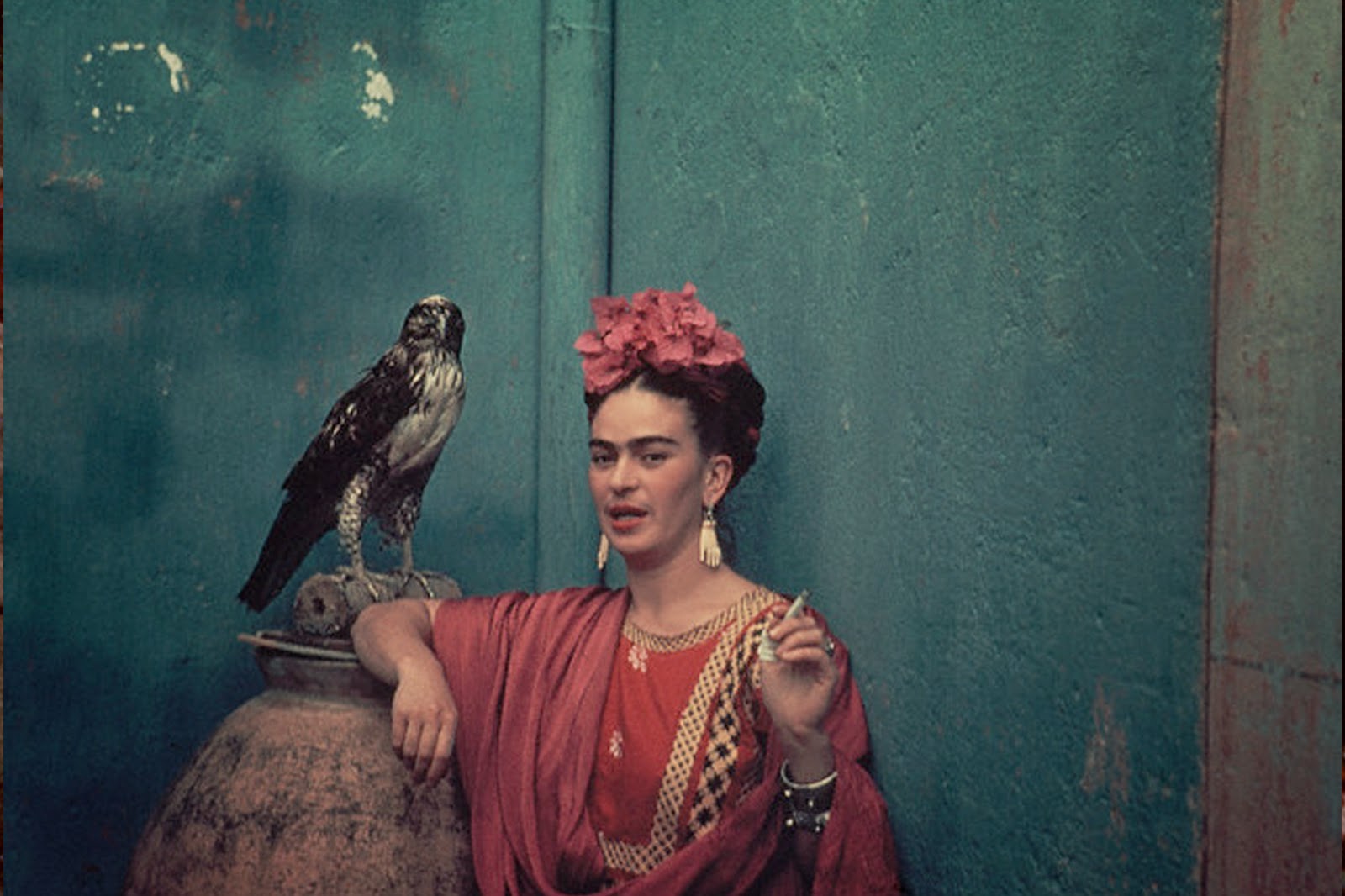
I recall clearly when my love affair with Frida began…
I was in my early teens when my parents took me to an exhibition to see the work of Mexican artist Diego Rivera. In a small section of the show there was a subsidiary exhibition of the work of artist Frida Kahlo, Diego’s wife. I was blown away by the power of her paintings, their tactile nature and the feast of colour and pattern presented in them. Full of references to indigenous Mexican culture, I was drawn to their primitive style and bold use of symbolism.
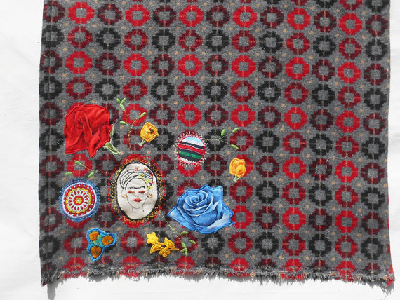
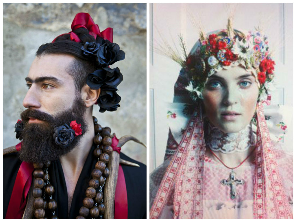
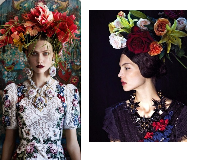
Since then I’ve been hooked and have looked to Frida’s work for inspiration in much of what I do – and I seem to not be the only one. Frida lives on as a modern-day cultural icon and references to her style and art can be seen in fashion trends, interior furnishings, photography, and popular culture on a regular basis. Personally, given half the chance I would surround myself in all things Frida-oriented! I recently treated myself to a gorgeous Queenie and Ted wrap with stunning embroidery and applique that to me is very Frida Kahlo. It has become my go-to autumn accessory!
So in celebration of Frida and her enduring influence on all things visual here are some images to inspire you… I hope you enjoy!
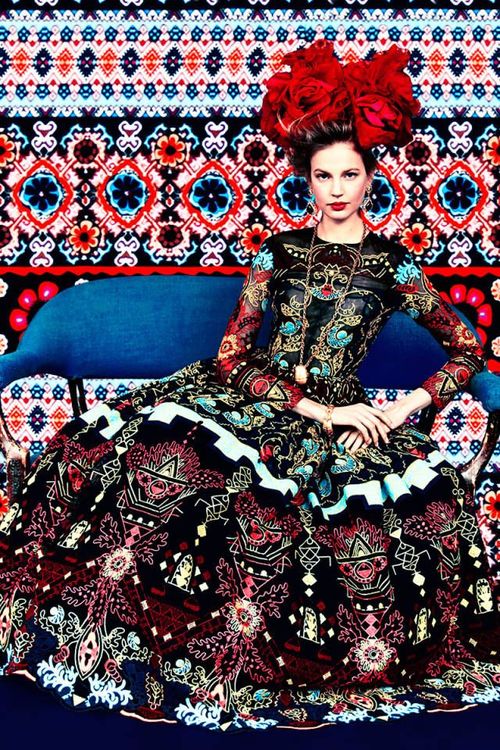
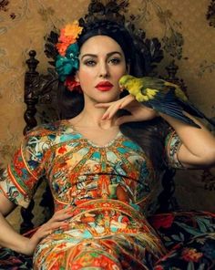
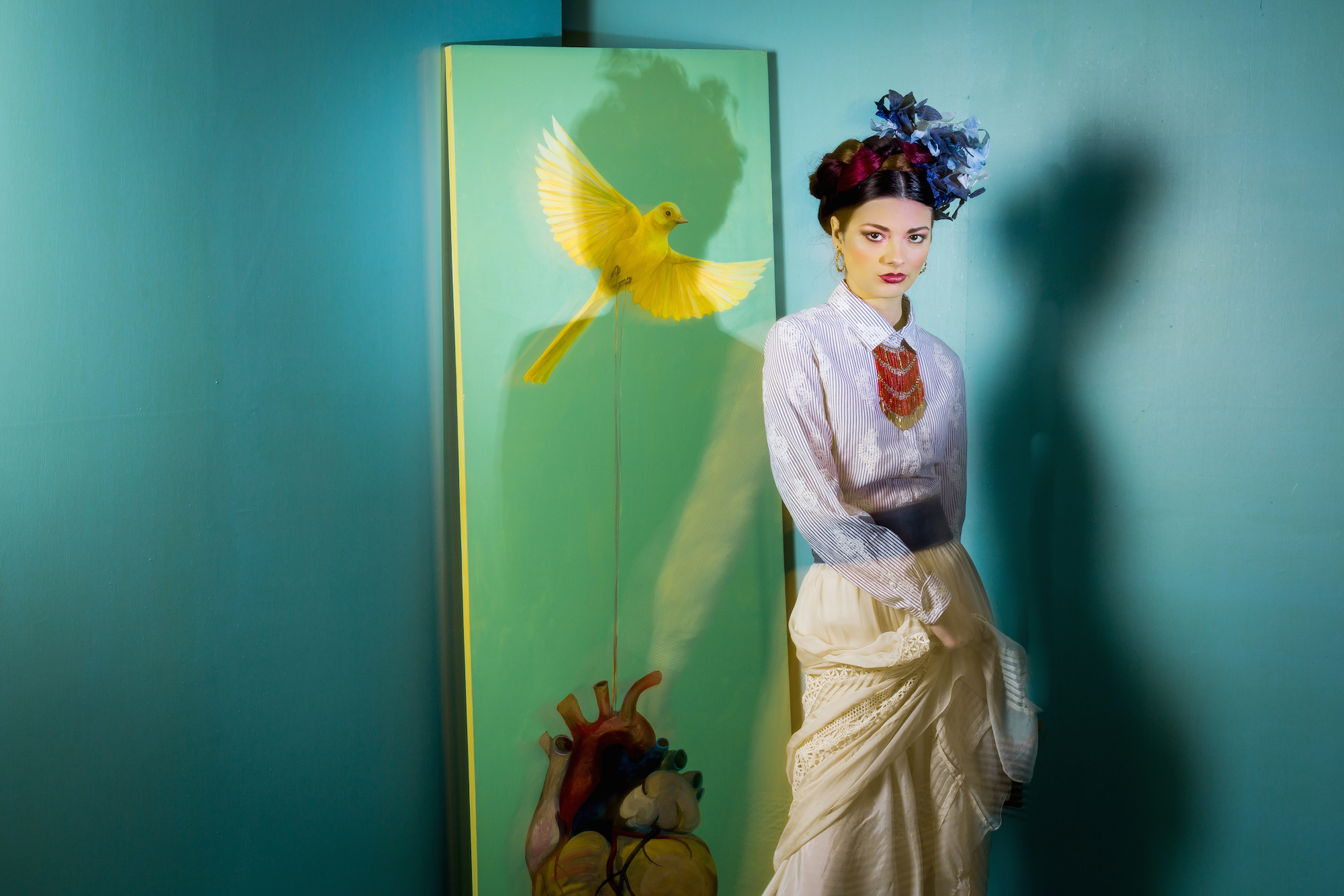
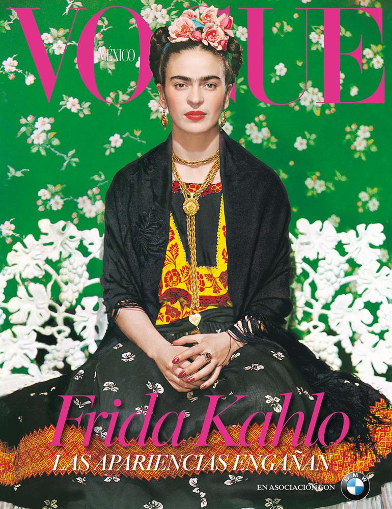
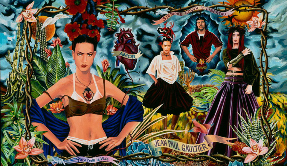
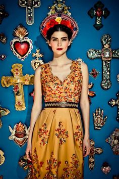
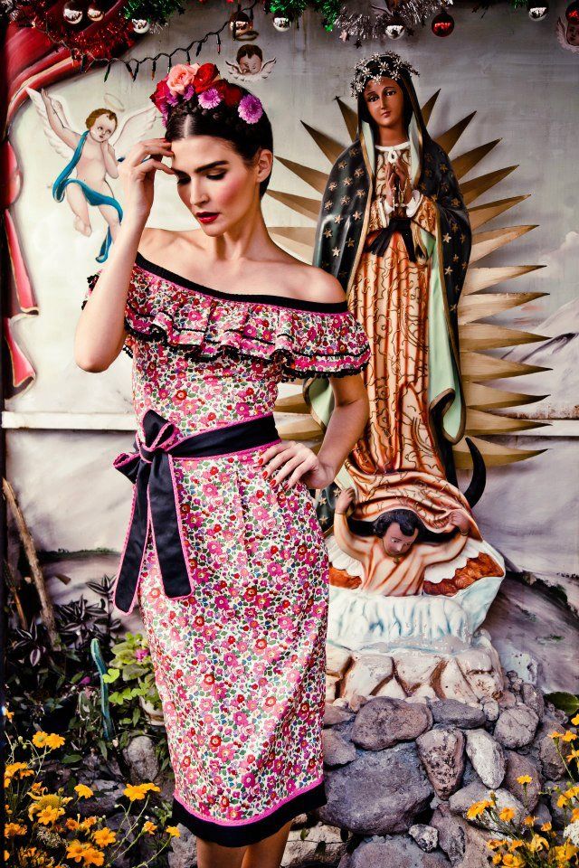
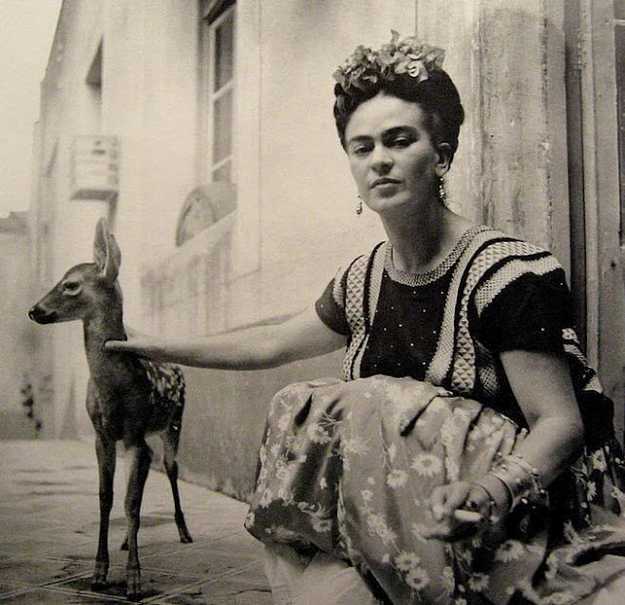
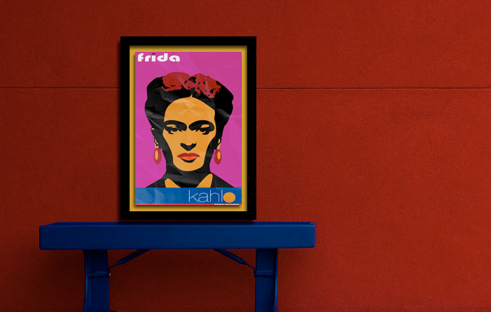
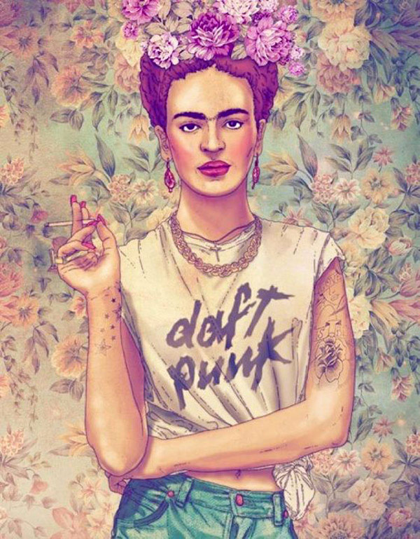
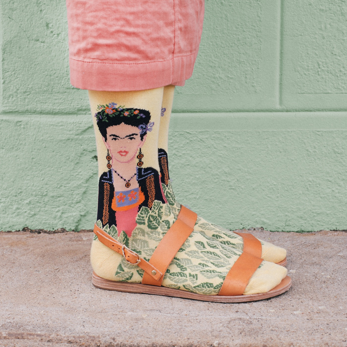
All hail Queen Frida. (pinterest)Influence on fashion. (pinterest)Interiors a la Frida. (pinterest)Colours and flowers. (pinterest)Folk, boho, and Frida come together in this stunning interior. (pinterest)Queenie and Ted Frida wrap. http://www.queenieandted.co.ukColours and symbolism. (pinterest)Frida gracing the cover of Vogue. (pinterest)Jean Paul Gaultier and Frida. (pinterest)It’s all about that centre parting! (pinterest)More influence on fashion. (pinterest)Frida and deer. (pinterest)Folk and Frida. (honestlywtf.com)‘Self-portrait with Monkeys’, detail. http://www.thecityreview.comInterior. (pinterest)Poster (Tano Design/pinterest).Bold colours and patterns. (pinterest)Frida-influenced moodboard. (www.molsandtatilois.com)Folk and Frida. (honestlywtf.com)Crockery by Wild and Violet. http://wildandviolet.bigcartel.com/Vibrant upholstery. (pinterest)Homage to Frida. Artist Yasumasa Morimura. (artnet)(pinterest)Gracing Vogue once more. (pinterest)Frida. (pinterest)Fashion and Frida. (pinterest)More fashion and Frida. (pinterest)Frida/Daft Punk. (kottke.org)Frida print from rockett st george. http://www.rockettstgeorge.co.uk/Frida socks (hotsox.com)
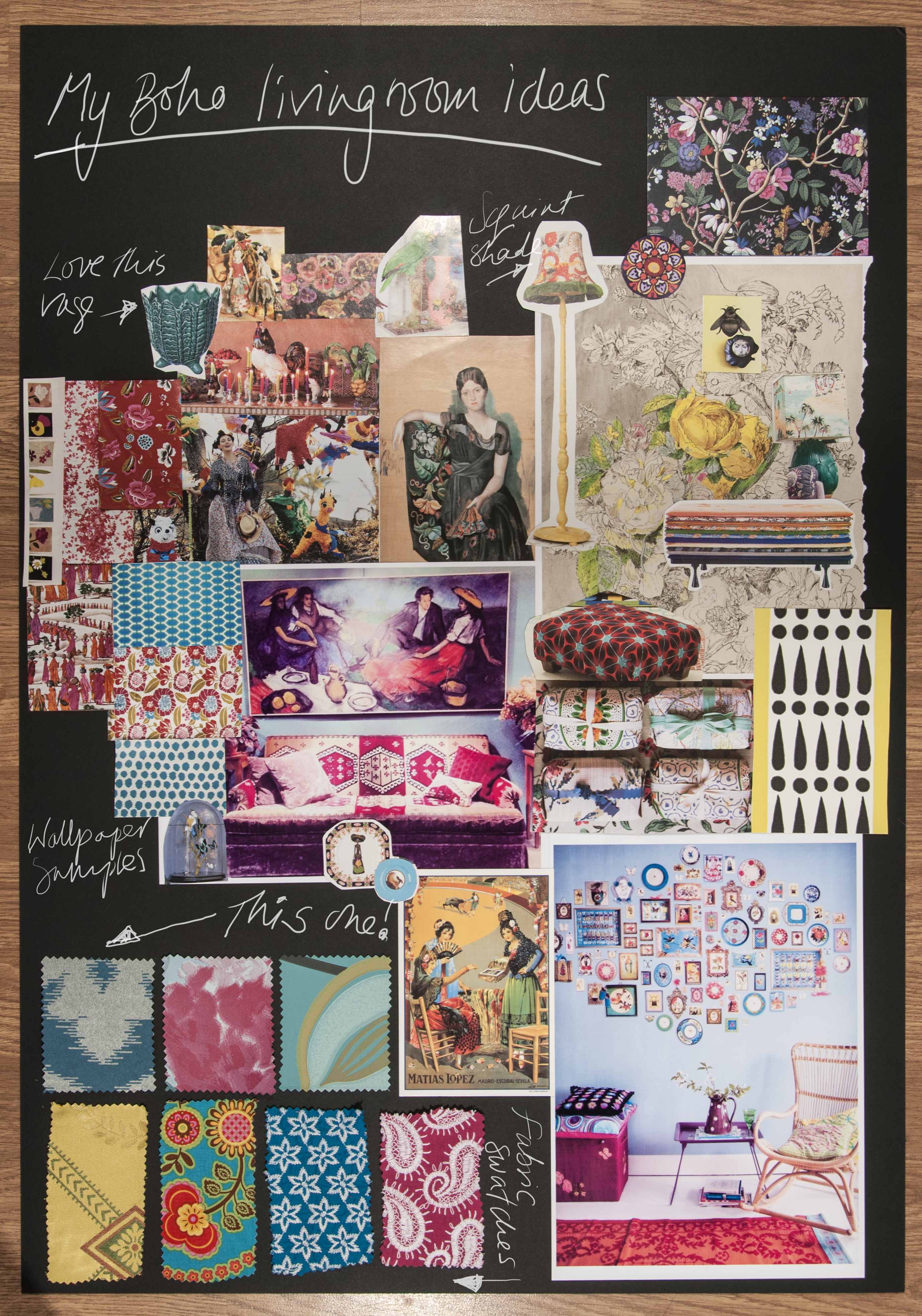
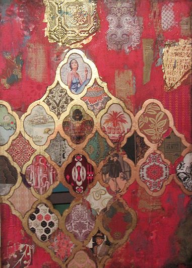
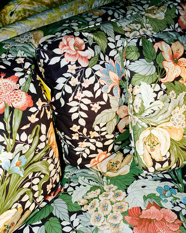
Who doesn’t love pattern? I certainly do. My philosophy is that there can never be too much. Pattern clashing rules.
Perhaps not for the faint hearted, but you really can layer pattern on pattern to your heart’s content. I can’t imagine a world without pattern. And a home without pattern… doesn’t bear thinking about! It can seem overwhelming dealing with pattern, but with a few basics up your sleeves and some belief in your ability to select and combine prints, you’ll be amazed at what can be achieved.
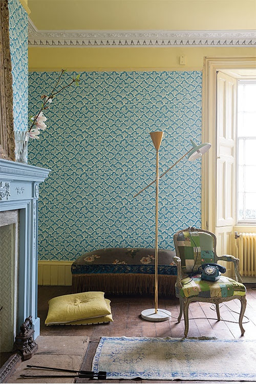
It’s not just about being brave with pattern; be adventurous with texture too. You can introduce pattern and texture into your home in many different ways. An obvious way is through accessories such as cushions, curtains, rugs, and throws. Wallpaper is a fantastic way of adding both pattern and texture. I am a huge fan of wallpaper (so much so I wrote and curated The Wallpaper Colouring Book!). These days you can find stunning wallpapers in all price ranges. Wallpaper Direct is a great starting point. It should come with a warning though… I can spend hours exploring on there and whole days can be lost.
Artwork is another way of bringing pattern into the home. This is a clever way of getting your pattern fix without committing to anything too permanent. I often frame wallpaper samples or pages from magazines to create mini worlds of pattern on the walls of my home. Experiment. If you don’t like it you can always change it at hardly any cost.
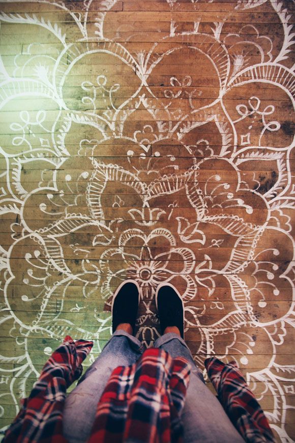
Stencilling is another way of adding pattern. On floors, walls and furniture, stencilling has come a long way of late and there are some truly beautiful sources of inspiration out there. Just stick ‘stencilling’ into the search bar on pinterest and you will be spoilt for choice!
And no one does it better than Tracy Porter, Poetic Wanderlust when it comes to pattern, particularly on crockery! Tracy is a designer after my own heart. I would happily decorate my home with her entire range! She carries pattern through every possible surface imaginable with true aplomb. Definitely worth a look if you are not already familiar with her work.
So go on, explore a little and channel your inner ‘brave’ self.
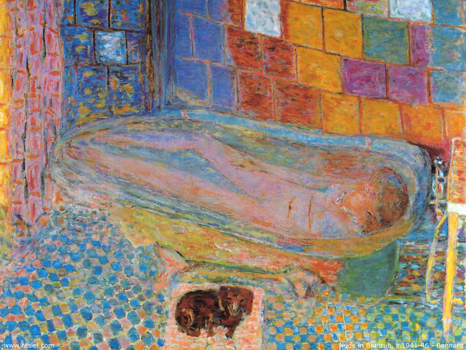
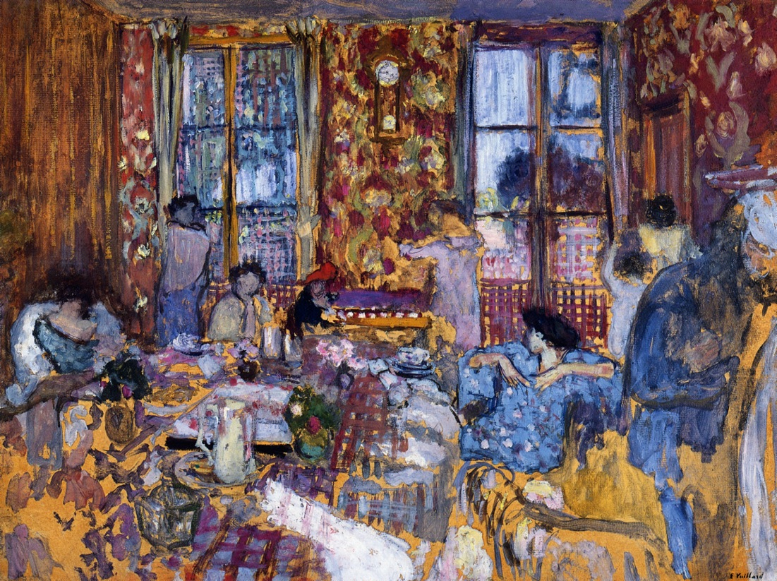
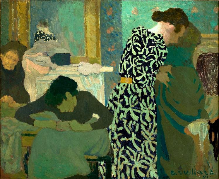
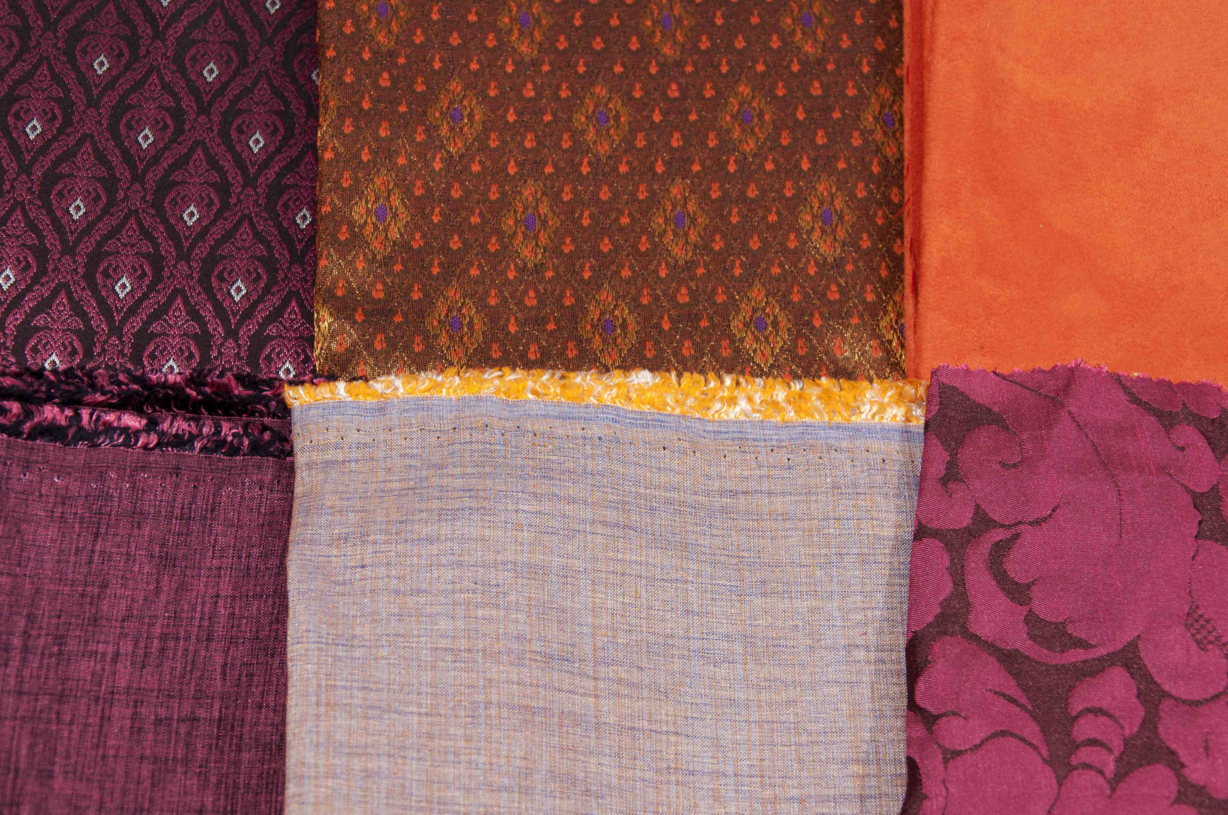
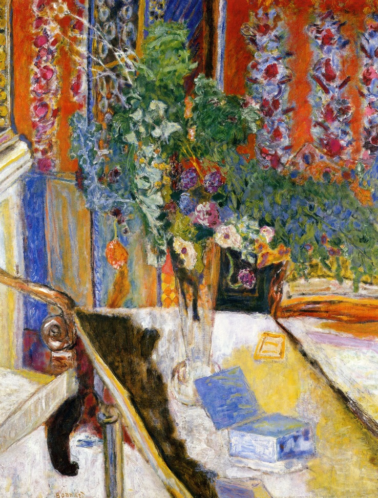
Pierre Bonnard (google images)(www.poeticwanderlust.com)Edouard Vuillard (google images)I heart Tracy Porter.A fantastic source of inspiration… the work of artist Jill Ricci. (jillricci.com)Pattern, colour and texture working beautifully together. (squint limited)Floral heaven (Found on arcademi.com).Just yum. (www.poeticwanderlust.com)Serious pattern clashing, but it works. (www.olyaivanova.com)Edouard Vuillard (google images)Tracy Porter rocks!(http://www.poeticwanderlust.com/inspiration.html)It’s not just about being brave with pattern; be adventurous with texture too. Here we can see orange suede, shot silk, damask and hand-woven material I brought back from Cambodia all working beautifully together. The colour palette is fairly constrained, but the juxtaposition of textures is what brings the excitement. (photo by Chris Gatcum)Pierre Bonnard (google images)I recovered this old wing-back chair I found online in some gorgeous 1950s barkcloth and some donkey-brown velvet. I’ve teamed this with a couple of contemporary print cushions and a cushion I made myself with Lucienne Day-style prints. This colour scheme is predominantly grey, black, and yellow, but I’ve lifted it with the lampshade, which has orange, green and blues in the pattern, and with the orange accent ceramic pieces. (photo by Chris Gatcum)Floor stencilling (blog.freepeople.com).